
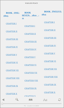
Screenshot of “War and Peace” from the Kindle iPad app
In a recent post for Gear Diary, Douglas Moran bemoaned the direction technological “advancements” are taking ereader apps and devices. As examples, he compared the original Barnes & Noble eReader (which he liked) to its replacement, the Nook app (which “kinda stinks”).
On a personal level, functionality is an ereader obstacle that turns me into an ebook curmudgeon. I recently was gifted a Kindle and I nearly threw it across the room trying to read “War and Peace” (as part of a year-long book club; I’m way behind).
Moran and others noted the simplicity of the Kindle and how its fewer features might make for a more straightforward reading experience. But perhaps the Kindle isn’t quite simple enough. In the end, I bought the print version of “War and Peace” and gave up on the device. Trying to toggle around links to read book notes was so clunky as to make that feature completely useless. Why not put the notes at the bottom of the page? Having links is great if 1. they’re easy and quick to access, and 2. you can return to your place in the book in some obvious, speedy fashion. Otherwise, just give me the content.
All this led me to questions regarding functionality and user experience in ereading:
- Are ereader developers focusing too much on technological possibilities and losing sight of reader behavior?
- For those of you who embrace ereading: What features on your reader(s) are extraneous or obtrusive to your reading experience?
- For developers: When working on a new app or an update, how do you incorporate the end-user into development?
Please share your thoughts in the comments.
Related: