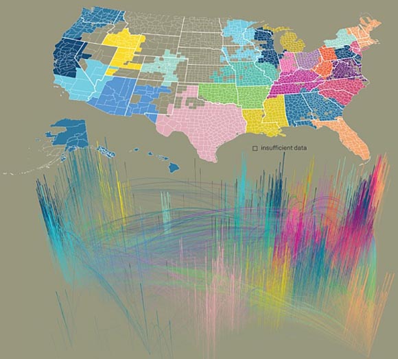
New technologies may blur boundaries, but in many ways geography still dominates how our relationships are formed. Researchers at AT&T Labs Research, IBM Research, and MIT SENSEable City Laborator have analyzed mobile phone and SMS data to demonstrate how place continues to play an important role in our relationships.
Here’s how the “The Connected States of America” project put mobile data to use:
Using millions of anonymized records of cell phone data, researchers were able to map the communities that people form themselves through personal interactions. The cell phone data included both calls and texts and was collected over a single month from residential and business users.
The analysis and accompanying visualization highlight the communities that are regional but that also stretch beyond official borders and across county and state lines. Some of the findings:
- California, Illinois, and New Jersey are split on a north-south basis.
- Pennsylvania is divided east-west.
- Some communities merge several states: Louisiana-Mississippi, Alabama-Georgia, New England.
- Some communication communities, such as Texas, actually match state borders quite closely.

Click to see the original graphic from “The Connected States of America” project. You can also check out more visuals and an interactive map.
Found a great visualization? Tell us about it
This post is part of an ongoing series exploring visualizations. We’re always looking for leads, so please drop a line if there’s a visualization you think we should know about.
Related:
