This is part of an ongoing series related to Peter Meyers’ project “Breaking the Page: Transforming Books and the Reading Experience.” We’ll be featuring additional material in the weeks ahead. (Note: This post originally appeared on A New Kind of Book. It’s republished with permission.)
Microsoft deserves most of the design criticism it gets, but let’s give them credit when they move in the right direction. What they’ve previewed in Windows 8 — especially the Metro touchscreen interface — is really lovely. It’s humane, efficient, and innovative. In fact, I think there’s plenty in it for digital book designers to think about emulating. I whipped out my notepad while watching one of their Build presentations — “8 traits of great Metro style apps” — and jotted down some key takeaways. (Also included are approximate timestamps so you don’t have to sit through the whole 90 minutes.) The best part? Whether or not Microsoft actually ships something that matches their demo, you can benefit from the great thinking they’ve done.
Tablet users’ postures and hand positions (16:31)
Microsoft did loads of research, hoping to identify how tablet users sat and where they placed their hands when holding these devices. The results are probably intuitive for anyone who’s spent time with a tablet, but the conclusions are nevertheless helpful. Most people use both hands to hold a tablet, and the most frequent touch zones are on the edges. The lesson? “To design for comfort, you need to position [key controls] near the edge” (19:23). And: “It takes a posture change to reach comfortably into the center of the screen (in any orientation).” In other words, it’s not that users can’t reach things in the middle of the screen, but it does require they change how they’re sitting. So, “put frequently used interaction surfaces near the edge,” and “locate key controls to be comfortable to use while holding on to the edges of a device.”
The difference between “fast & fluid” and “slow & jerky” (25:45)
The first phrase is Microsoft’s (it’s how they claim Windows 8 will perform; by the looks of the demo, they’re pretty far along). The second phrase is mine, but in the demo it’s clear that’s what they want developers to stop doing. How? By using Microsoft-supplied transitional effects — for example, animating the way picture icons arrive on screen as users add them to a list. This might sound like frivolous eye candy, but the demo makes the point convincingly: these little points of polish make users feel a closer connection to the content and less like there’s an engineer standing between them and what they want to do.
Specifically, what Microsoft is encouraging developers to do is use Windows 8’s “Animation Library” to implement these effects and take advantage of things like hardware acceleration. This, they argue, saves programmers from having to master animation flourishes or learn After Effects; the ready-to-use animations take care of the design work. I mention all this because a sluggish reading experience — even one that’s half a second too slow — can cause readers to bail.
This reminds me of a conversation I had last winter with Theo Gray, author of “The Elements for iPad” and one of the principals behind Touch Press. He was previewing an in-progress app for me and stopped the demo mid-way through. One of the gems onscreen that was supposed to spin was lagging a tiny bit. If you’re even off by a little, he said, users will notice. Sweating the details like this may be one reason the Touch Press apps are so successful.
“A language for touch” (27:30)
The point Microsoft makes in this part of the presentation is, if you’re making a touchscreen app, don’t have fingers and touch gestures replicate what a mouse does. Multitouch screens can and should be controlled differently than our regular computers. And Microsoft makes this case by poking fun at the cumbersome steps an iOS user has to go through to drag an app icon from one home screen to another that’s far away: “it’s like driving a car from one side of the ocean to another.” Anyone who’s got more than a few screen’s worth of apps knows what they’re talking about. What Apple has currently designed is really the equivalent of how you’d scroll horizontally with a mouse (except in iOS there are no quick scrollbar shortcuts).
The solution that Microsoft demos is neat (28:48): you hold the app icon you want to move in place with one finger and then, with your other hand, you pan under it, swiping the screens quickly to get to the new placement spot where you want to drop the icon. It’s very slick, and it’s a reminder of the benefits of designing explicitly for a touchscreen.
“Semantic” zoom (33:25)
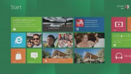
By now we’re all used to tapping touchscreens to zoom in closer on an image or bump up the font size of an article. Microsoft has introduced a twist: zooming gestures now frequently deliver more and different kinds of info as users view content at different magnification levels. For example, when viewed up close, a group of neighboring app icons on the home screen might look like this:
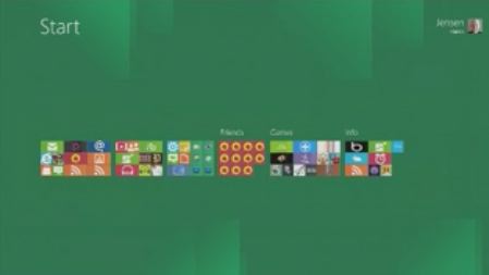
But when the user zooms out to a bird’s-eye view, that same group acquires a label, delivering an extra helping of information to help browsers decide where to go next or to rearrange groups into a different order.
The same kinds of semantic additions at different zoom levels could be helpful for digital book designers looking to provide different views (book-wide, chapter-level, and so on) for readers browsing through different levels of detail. A few months ago I wrote about Glo Bible and something similar they’ve done with their outline zooming tool.
True multitasking (46:42)
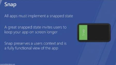
In Metro, two apps can co-exist side by side on the main screen. One sits center stage, and the other gets tucked in this so-called “snap” state: a compressed rectangular view that apps occupy when they cede the main part of the window to another app.
“A great snapped state,” presenter Jensen Harris says, “invites users to keep an app on screen longer.” These truncated views are fully functional. One fun example that gets a mention: imagine a piano app in snap state, a drum app on the main screen, and the user playing both of them at the same time. In other words, true multitasking and a world in which users are encouraged to make their apps interact with each other. It’s a compelling reminder of something many serious readers (and writers) do all the time in the real world: keep multiple documents open simultaneously.
 Webcast: Digital Bookmaking Tools Roundup #2 — Back by popular demand, in a second look at Digital Bookmaking Tools, author and book futurist Pete Meyers explores the existing options for creating digital books.
Join us on Thursday, November 10, 2011, at 10 am PT
Register for this free webcast
Related:


