This is part of an ongoing series related to Peter Meyers’ project “Breaking the Page: Transforming Books and the Reading Experience.” We’ll be featuring additional material in the weeks ahead. (Note: This post originally appeared on A New Kind of Book. It’s republished with permission.)
Hyperlinks often get marquee billing as one of ebooks’ main advantages over print: an easy way to expand the scope and depth of any document, enriching it — and its readers — with targeted additions. I’ve participated in plenty of ebook development projects in which links are regarded as a kind of bare minimum, enhancement no-brainer. But do hyperlinks always help? Does their presence ever hurt the reading experience? No and sometimes. Let me take a crack at breaking down the downside of linking and review a few alternatives.
Defensive linking
Some links read, to me at least, like a kind of defensive gesture on the part of the writer. As proof that he really knows what he’s talking about and is ready to share notes and research to bolster the authority his writing aspires to. But consider how distracting a link-laden sentence like that is. Even when not followed, a link poses a concentration-disrupting challenge: Should I click it? I wonder where it leads to … I think writers (on the web, as much as in ebooks) need to do a careful cost/benefit analysis before adding any link. Is the journey you’re sending readers on really worth the destination and the disruption?
In lieu of links: Margin notes
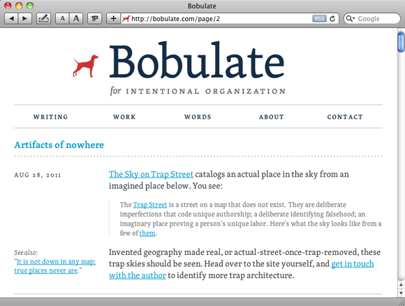
Some writers have experimented with margin notes as a kind of hyperlink alternative. Liz Danzico, over at Bobulate.com, uses the space in the left-hand margin to gently comment on her main writing.
She does link within the body text, but I like how the side-saddle layout shown in the image gently engages the reader’s peripheral vision, leaving us free to complete whatever currently holds our attention (a sentence, a paragraph). We can then review the margin note at a more natural break point. Contrast that with a link that’s inserted directly into a sentence; even if you choose not to follow it, the gravity of its target can tug at your attention.
End of post linking
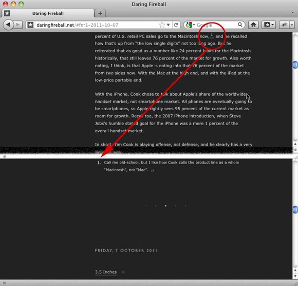
Others position their link targets at the end of a section, chapter, or blog post. The idea here is to deliver background and suggested readings at more natural break points, keeping the main text more or less link free. John Gruber’s Daring Fireball blog uses in-text links for his footnotes. They swoop readers off to the end of the post, and then provide a link for the readers’ quick return to the point of departure.
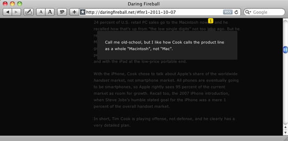
When installed, a Safari and Chrome plug-in called Footnotify, automatically turns links like the one shown in the previous image into a tidy pop-up window:
Snippet preview
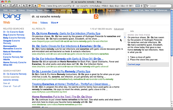
Here’s another interesting way to keep readers from orbiting away from your writing: Offer them a quick glimpse at the target content. It’s similar to how Bing and Google present search result snapshots, saving users the hassle of having to click through and inspect each listing.
The challenge here is all about implementation. Sprinkle too many of these on a page, or program things in an oversensitive way (so that pop-up windows launch willy-nilly), and your page turns into a mine field of exploding pop-ups.
Over-obvious targets
Can we agree that the average reader knows how to make her way to sites like Amazon and the White House? Isn’t it an unnecessary intrusion, then, to link to targets like these? This point, I realize, is highly subjective. Who’s to say what’s obvious? In my own writing I’ve chewed over the question of how often and whether to link to various apps I mention. On the one hand, I question what value it adds to link to popular apps like the Kindle, Angry Birds, or Flipboard. Given the topic I frequently write about — touchscreen publishing and ebook design — it would be easy for me to end up with a distracting number of links. But then, occasionally, there are obscure or ambiguously named apps I mention (a particular Dracula or Sudoku app — both of which inhabit categories crowded with similar sounding names). Should I provide links in only these cases? And what exactly is the rule here? (That’s an important consideration for publishers with style guides.)
Ethics & affiliate linking
These are the money-making programs that most big ecommerce sites offer. Add a special code to those links on your lizard fashion blog and anyone who clicks and then buys something from, say, Amazon earns you a small commission. Do writers who use such links owe their readers some kind of notification? (Personally, I haven’t signed up for any of these affiliate programs yet, but that’s mainly because I haven’t gotten around to it.)
Work avoidance links
Some writers seem to think that the mere existence of Wikipedia relieves them of the duty to explain difficult concepts. It’s a kind of serve-yourself approach to writing — a feeling that, hey, why should I waste space explaining terms like “long tail” or “multi-touch” when I can just point to Wikipedia? Good writing shouldn’t require a reader to go somewhere else for an explanation.
One window per link
Links often kill a reader’s momentum by whisking them away from whatever they’re reading. Click a link and either a new window launches or the current window’s contents get replaced with the target material. A few designs out there offer some alternatives. I’ve written previously about what might be called the “expandable page”, in which additional material (a footnote, for example) sprouts when a reader clicks a “+” icon, and then disappears when the user clicks the corresponding “-” button. Another option: a sliding panel, which is the same concept, except a pane slides onscreen with the link’s extra info.
Non-obvious link targets
Some links suffer the exact opposite of the obtrusive link problem. Instead, readers get no signal about where to click or tap. In the Jack and the Beanstalk Children’s Interactive Storybook app, there’s at least one screen containing Jack and his mom where the user is given no signal that either character can be tapped. Both characters reward tappers with additional dialogue that sheds light on their relationship.
One solution can be seen on a JFK memorial website, The President’s Desk.
Intermittently sparkling bursts of light signal which items are ready for exploration. For viewers who prefer to browse (as opposed to waiting for these flashes), yellow outlines appear around clickable objects as you mouse over them.
Toggling links on and off
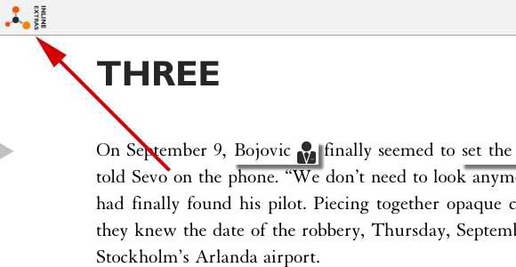
Short-form publisher The Atavist has a nice compromise for readers who don’t care for a page full of links. Every Atavist publication comes with a collection of tap-to-summon extras: photos of key figures, Google Earth maps to help track location, a timeline, and so on. But if you find any of this stuff distracting, simply tap the Inline Extras icon at the top left of the screen.
In an instant, all the links disappear, and you’re back to plain prose and the pleasures of uninterrupted reading.
 Webcast: Digital Bookmaking Tools Roundup #2 — Back by popular demand, in a second look at Digital Bookmaking Tools, author and book futurist Pete Meyers explores the existing options for creating digital books.
Join us on Thursday, November 10, 2011, at 10 am PT
Register for this free webcast
Related:

