
 Remember the days before you could pull your smartphone out of your pocket and get instant directions from your current location to anywhere in the world? It’s kind of foggy for me, too.
In fact, I’m so used to relying on my smartphone that I feel increasingly flustered when wandering the aisles of Costco, locating the elephant house at the zoo, or searching for decent food at the airport. Shouldn’t my magical pocket computer help me with this, too?
The answer is “yes,” of course. But there are challenges to implementing indoor navigation today.
User interface
The maps app on your smartphone has one primary concern: getting you from 106 Main Street to 301 Sunny Lane, or from work to home, or from home to Taco Bell. Why are you going to Taco Bell and what percentage of your taco beef will be meat filler? The app doesn’t need to know. Thus, the typical interface for a smartphone maps app is a big map and a search box.
You might assume that an indoor navigation app for, say, the American Museum of Natural History has the same primary concern: getting you from the main entrance to the T-Rex. But why go to the T-Rex? How do I know there’s a T-Rex here anyway? And what if my kids have 20 things they want to see and we only have two hours to see everything? And what’s going on this week — are there special exhibits?
It turns out that creating a useful indoor navigation app requires more than navigation. So, an effective mobile UI should be more “smart guide” and less “paper maps” on your smartphone.
It’s a design challenge, like any other mobile app. Help visitors decide where they need to go first, then direct them there.
Integration
Getting directions to the plumbing section of a store is certainly useful. But let’s say you’re looking for a particular Delta kitchen faucet. Wouldn’t it be more useful to search in a retail app for “Delta faucet,” check that it’s in stock, then get directions right to that product? Who cares if it’s in the plumbing section or the kitchen section?
To be truly useful, an app needs to integrate with dynamic data.
Similarly, a university campus app could offer to guide a student to “Kennedy Hall Room 203,” but wouldn’t it be better to search for “Econ 101” instead? Who cares where Econ 101 takes place today? Even better, just have students enter their name once, fetch their schedule, and automatically take them to whatever their next class is. Why make users do more work than they have to?
Current location
OK, so you decide you want directions to that Delta faucet I mentioned earlier. Ideally, the app will automatically start from your current location.
Now comes the great sadness: GPS, as you may know, does not work indoors. The satellite signals are just too weak to penetrate anything much thicker than the metal roof of your car.
However, all modern smartphones have Wi-Fi built in, and wireless networks are common enough in indoor spaces that an app could easily scan for known access points and calculate your position using trilateration.
Here’s the catch, however: Unlike the wide open world of Android, developers on the iPhone side aren’t allowed to perform these Wi-Fi “signal scans.”
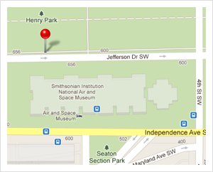
Fortunately, there are alternatives. One approach is to make the building do the work instead of the device. Some Wi-Fi installations, such as the Cisco MSE, can determine the location of any wireless device in the building. The access points themselves listen for the Wi-Fi signals created by your phone, then estimate its position via trilateration. This solution has been deployed successfully at a few locations, including at the American Museum of Natural History.
Designing for inaccuracy
One consequence of most indoor positioning systems is a lower degree of accuracy compared to GPS. For instance, indoor systems can usually guess which room you’re in, and that’s about it. Precision depends on signal fluctuations, which depend on factors like how many people are in the room, how you’re holding your phone, and other vagaries.
An effective mobile app must design for this reality from the very beginning. One technique that will help users greatly is to point out quickly recognizable features of the environment.
The Meridian app, for example, uses a short text label to describe each direction step. (Disclosure: I’m the CTO and co-founder of Meridian.) Below, “Rose Room” is clearly marked in the “real world” space and easy to spot, as are the stairs headed down.
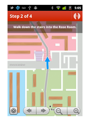
The Meridian app uses step-by-step text labels.
The best way to combat inaccuracy, however, is by making it as easy as possible for users to self-correct. In the Meridian app, the map can easily be dragged, rotated, zoomed in and out, and the turn-by-turn steps can be flipped through with ease. If the starting location isn’t perfect, the user will instinctively drag around and figure it out.
Putting it all together
Building amazing indoor app experiences is not only possible, it’s already happening. This year alone, many places — from stadiums and retailers to museums and corporate campuses — have launched apps that are used by hundreds of people every day for navigation and to access location-based content.
Indoor Wi-Fi positioning technology isn’t a research project anymore; it’s out there and works with the devices we all now carry. With the right user interfaces, it can be just as effective as GPS is outdoors.
It’s time to spread the incredible experience of wandering around a place as enormously complex as the History Museum without ever feeling lost.
Related: