
 The world population is expected to hit seven billion some time in the next few days. The United Nations has a countdown clock, of sorts, with a counter ticking steadily forward.
The Guardian, along with the Spanish design house Bestario’s, has taken data from the U.N. to create a visualization of changes in global population.
The visualization depicts population past, present and future — namely, numbers from 1950, from 2010, and 2100. You can click on countries to view their individual trajectories as well as countries with comparable growth patterns.
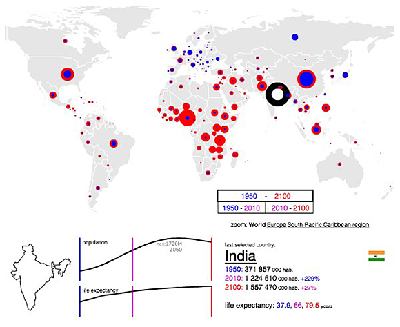
Screenshot showing India’s population growth and a prediction for the year 2100. (Click to see full interactive visualization.)
The United Nations has taken its data and created a visualization of its own, one that includes more details about fertility and age groups.
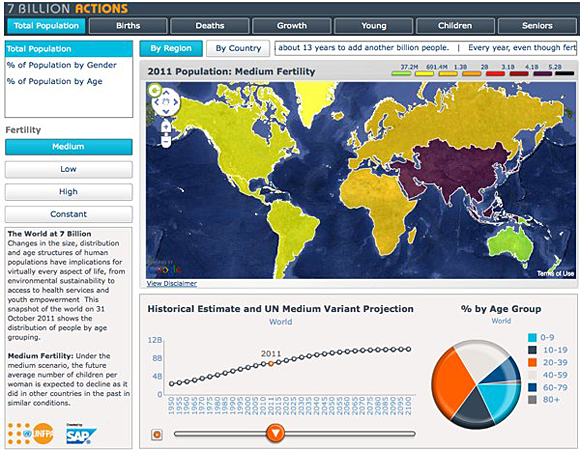 The UN put its population data to use in its own visualization. (Click to see full interactive version.)
Found a great visualization? Tell us about it
This post is part of an ongoing series exploring visualizations. We’re always looking for leads, so please drop a line if there’s a visualization you think we should know about.
 Strata 2012 — The 2012 Strata Conference, being held Feb. 28-March 1 in Santa Clara, Calif., will offer three full days of hands-on data training and information-rich sessions. Strata brings together the people, tools, and technologies you need to make data work.
More Visualizations: