
The web-like patterns of British auto travel in the visualization below are quite beautiful — that is, until you discover it’s a map of traffic casualties. The visualization depicts the locations of more than two million road crashes in the UK between 1999 and 2010. Each light point on the map represents a collision that resulted in a casualty; the brighter the light, the more frequently collisions occurred in that spot.
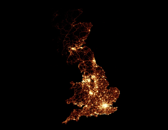
Screenshot from the BBC’s traffic accident visualization. See the full version.
The original map was created by the BBC and can be viewed here. Accompanying the map is a video animation of the crash data, along with more detailed information about particular areas. Visitors to the site can enter their address information to see local crash data, broken down by time and by vehicle type.
Found a great visualization? Tell us about it
This post is part of an ongoing series exploring visualizations. We’re always looking for leads, so please drop a line if there’s a visualization you think we should know about.
 Strata 2012 — The 2012 Strata Conference, being held Feb. 28-March 1 in Santa Clara, Calif., will offer three full days of hands-on data training and information-rich sessions. Strata brings together the people, tools, and technologies you need to make data work.
More Visualizations: