
What do your Facebook friends have in common? (Well, other than all being your Facebook friend, of course.) What “likes” do they share?
Tony Hirst, a lecturer in the Department of Communication and Systems at The Open University, built a visualization that shows this connective data. He’s also a written a step-by-step guide on how he constructed the visualization with Google Refine and Gephi.
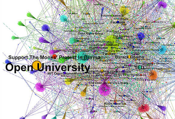
The result is a network diagram of what Hirst’s friends commonly “like.” He notes:
“Rather than returning likes, I could equally have pulled back lists of the movies, music or books they like, their own friends lists (permissions settings allowing), etc, etc, and then generated friends’ interest maps on that basis.”
Found a great visualization? Tell us about it
This post is part of an ongoing series exploring visualizations. We’re always looking for leads, so please drop a line if there’s a visualization you think we should know about.
 Strata 2012 — The 2012 Strata Conference, being held Feb. 28-March 1 in Santa Clara, Calif., will offer three full days of hands-on data training and information-rich sessions. Strata brings together the people, tools, and technologies you need to make data work.
More Visualizations: