
Here are a few of the data stories that caught my attention this week.
Data and personalization drive Yahoo’s front page
Yahoo offered a peak behind the scenes of its front page with the release of the Yahoo C.O.R.E. Data Visualization. The visualization provides a way to view some of the demographic details behind what Yahoo visitors are clicking on.
The C.O.R.E. (Content Optimization and Relevance Engine) technology was created by Yahoo Labs. The tech is used by Yahoo News and its Today module to personalize results for its visitors — resulting in some 13,000,000 unique story combinations per day. According to Yahoo:
“C.O.R.E. determines how stories should be ordered, dependent on each user. Similarly, C.O.R.E. figures out which story categories (i.e. technology, health, finance, or entertainment) should be displayed prominently on the page to help deepen engagement for each viewer.”
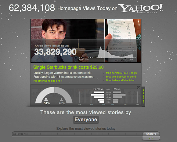
Screenshot from Yahoo’s CORE data visualization. See the full visualization here.
Scaling Tumblr
Over on the High Scalability blog, Todd Huff examines how the blogging site Tumblr was able to scale its infrastructure, something that Huff describes as more challenging than the scaling that was necessary at Twitter.
To put give some idea of the scope of the problem, Hoff cites these figures:
“Growing at over 30% a month has not been without challenges. Some reliability problems among them. It helps to realize that Tumblr operates at surprisingly huge scales: 500 million page views a day, a peak rate of ~40k requests per second, ~3TB of new data to store a day, all running on 1000+ servers.”
Hoff interviews Blake Matheny, distributed systems engineer at Tumblr, for a look at the architecture of both “old” and “new” Tumblr. When the startup began, it was hosted on Rackspace where “it gave each custom domain blog an A record. When they outgrew Rackspace there were too many users to migrate.”
The article also describes the Tumblr firehose, noting again its differences from Twitter’s. “A challenge is to distribute so much data in real-time,” Huff writes. “[Tumblr} wanted something that would scale internally and that an application ecosystem could reliably grow around. A central point of distribution was needed.” Although Tumblr initially used Scribe/Hadoop, “this model stopped scaling almost immediately, especially at peak where people are creating 1000s of posts a second.”
 Strata 2012 — The 2012 Strata Conference, being held Feb. 28-March 1 in Santa Clara, Calif., will offer three full days of hands-on data training and information-rich sessions. Strata brings together the people, tools, and technologies you need to make data work.
Visualization creation
Data scientist Pete Warden offers his own lessons learned about building visualizations this week in a story here on Radar. His first tip: “Play with your data” — that is, before you decide what problem you want to solve or visualization you want to create, take the time to know the data you’re working with.
Warden writes:
“The more time you spend manipulating and examining the raw information, the more you understand it at a deep level. Knowing your data is the essential starting point for any visualization.”
Warden explains how he was able to create a visualization for his new travel startup, Jetpac, that showed where American Facebook users go on vacation. Warden’s tips aren’t simply about the tools he used; he also walks through the conceptualization of the project as well as the crunching of the data.
Got data news?
Feel free to email me.
Related: