
As Flowing Data’s Nathan Yau remarked earlier this week:
“I get kind of giddy whenever I see a tweet from Martin Wattenberg and Fernanda Viegas. They rarely tweet, but when they do, it’s usually because they’ve released a new project and they always announce it simultaneously.”
Tweets this week from the two renowned data visualization artists unveiled their latest project: Wind Map. It’s a beautiful visualization — Van Gogh-like with its swirling patterns — created using “close to live” data of the country’s surface wind speed.
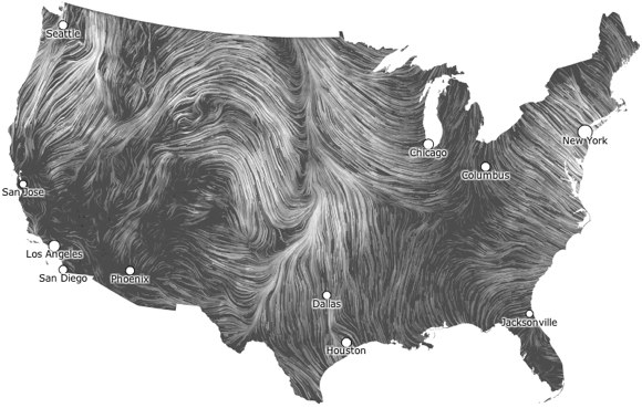
The trajectory of wind flowing across the U.S. Click to see animated/interactive version.
In addition to watching the patterns of the winds flow, you can click to zoom in and see more information about wind speed and direction.
Data for the map comes from the National Digital Forecast Database. As such, the data is currently U.S.-only, but Wattenberg and Viegas say they’re interested in expanding the Wind Map. (“If you know of a source of detailed live wind data for the entire globe,” they write, “please let us know.”)
Found a great visualization? Tell us about it
This post is part of an ongoing series exploring visualizations. We’re always looking for leads, so please drop a line if there’s a visualization you think we should know about.
 Fluent Conference: JavaScript & Beyond — Explore the changing worlds of JavaScript & HTML5 at the O’Reilly Fluent Conference (May 29 – 31 in San Francisco, Calif.).
More Visualizations: