
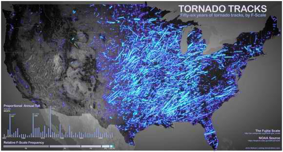
This week’s visualization comes from John Nelson of IDV Solutions, who has taken data from the National Oceanic and Atmospheric Administration (NOAA) to map tornado paths and F-Scale frequencies.
Nelson describes the visualization:
“It tracks 56 years of tornado paths along with a host of attribute information. Here, the tracks are categorized by their F-Scale (which isn’t the latest and greatest means, but good enough for a hack like me), where brighter strokes represent more violent storms.”
Found a great visualization? Tell us about it
This post is part of an ongoing series exploring visualizations. We’re always looking for leads, so please drop a line if there’s a visualization you think we should know about.
 OSCON 2012 — Join the world’s open source pioneers, builders, and innovators July 16-20 in Portland, Oregon. Learn about open development, challenge your assumptions, and fire up your brain.
More Visualizations: