
In a recent talk at the SEE conference in Germany, data illustrator Stefanie Posavec opened her talk with a sobering observation about how she had found the data visualization field really intimidating.
Her experience was that many visualization bloggers and active participants seem to believe in one right way and lots of wrong ways to create a visualization. To those entering the field, these types of views will create a fair amount of confusion, inconsistency and contradiction. It demonstrates our current glass-is-never-full tendency toward critical evaluation.
This should act as an important wake-up call to all of us who care about maintaining an accessible and supportive community around data visualization and infographic design, particularly as these disciplines continue to penetrate the mainstream consciousness.
The fear is that Posavec’s expressing of this view is just the tip of an iceberg. Who knows how many designers outside of the spotlight hold a similar perception and are reluctant to share their work and engage with the field?
In this article, I seek to take a detached view of the visualization field and weave in my experiences from delivering introductory data visualization training courses over the past year. I want to take a look at the constituency of this discipline and the role of critique to see how Posavec’s experiences could have materialised and contrast them with the people I meet in my classes.
The visualization ecosystem
One of the most rewarding personal experiences from my training courses has been getting the chance to mix with a variety of delegates from different countries, cultures, occupations and industries. Spending time with essentially everyday people, learning as much from them as they do from me, has been hugely refreshing. The term “everyday people” could be perceived as condescending, but far from it. Allow me to elaborate.
When you are an active participant in a field like data visualization you spend most of your time consuming and digesting information from your peers. This can create a bubble of exposure to just those hardcore connoisseurs — the academics, the authors, the designers and the bloggers — who have spent years refining their knowledge and perfecting their craft.
This is the sharp-end of the field where the intensity of debate, knowledge exchange and opinion expression is high. The observations emerging at this level represent the most perceptive, creative and comprehensive insights into the design techniques on show today. The attention to detail, the care for quality and the commitment to evaluation and feedback is significant. However, it can inadvertently create a certain suffocating or perhaps inhibiting barrier for many looking to learn and develop their capabilities.
A key observation from my training courses has been the sense that we in the field could be accused, at times, of a certain amount of design snobbery. We criticise and lambast many of the popular but “trashy” infographics, and believe them to be an inferior practice. However, during training sessions, I invite delegates to assess a variety of different types of visualization design, including such infographic pieces. I often hear comments that express and reason a preference or even a “like” for pieces that I would not. This has proven to be a highly illuminating experience.
A consequence of associating with or belonging to this top-tier “bubble” is that you can become somewhat detached and even oblivious to the opinions of those who might be considered to exist in the real world. These are the casual enthusiasts, the everyday people I mentioned early. They are likely to be beginning their journey into the field or have been nibbling around the edges for a while, but probably never too seriously until now. In contrast to the hardcore connoisseurs, this lower-expertise but more highly populated tier of the field’s pyramid of participants makes up a totally different demographic and psychographic.
These people provide a great tapestry of different opinions, backgrounds and capabilities and, generally, they offer a more sympathetic, fresh and open-minded view on visualization design. Without the burden of knowledge, theories and principles that the rest of us carry around with us all the time, and by not living and breathing the subject across every waking hour, their appreciation of visualization is more rooted in taste, instinct and fueled by a fresh enthusiasm to consume information in visual form.
Beyond and beneath this middle-tier sits, well, everybody else. These are the purely occasional consumers and nothing more. Their daily roles may not have anything to do with data, they possibly don’t even know or probably care what visualization is. Yet, they belong to the almost silent but abundant cohort of people who are occasionally curious enough to look at an attractive visualization or light-weight infographic. They don’t want or need to learn about the field, they just find enough interest in having a look at some of its output.
This is the true make-up of the visualization and infographic field, and we need to appreciate its relevance.
The irrationality of needs: Fast food to fine dining
There is a prominent, long-established film critic in the U.K. who is generally considered a fair and sound judge of movies. He has a deep subject expertise and is capable of fully reasoning all his reviews with thorough analysis. Despite this, he does occasionally resort to the riposte “other opinions are available, but they’re the wrong ones” when challenged by readers or viewers.
As with any subject’s “expert” tier, we in data visualization can find ourselves being a little too closed off, perhaps believing the merit of our views hold greater weight than other, contrary opinions from outside. But this is largely because we don’t always entirely appreciate the variety of intentions and needs behind visualization designs. Furthermore, there are so many different contexts, target audiences and formats through which visual communication of data can exist.
Sometimes we’re looking to impart a data-driven communication where the absolute accuracy of interpretation is vital. On other occasions it might be about creating a visual representation of data to impact more on an emotional level, trying to change behaviour and connect with people through non-standard methods. Sometimes we are working on subjects that are important, complex and deep, and require a more engaging and prolonged interactive exploratory experience. By contrast, we might just be presenting some rather lightweight facts or stats that relate to a harmless, maybe even “fun,” subject matter.
This is where a comparison with other creative territories like music, TV, movies and food is appropriate to help illustrate how fundamentally impulsive, inconsistent and irrational our tastes can be. Of course, the intention is very different with these channels of expression, but still we can relate to experiences when we sometimes prefer a fast food meal or to feast on junk food snacks as opposed to sitting down to a wholesome, home-cooked meal. We know it’s probably bad for us, we’ll probably spend more money on it and we know we’re likely to be hungry again in an hour, but we still do it.
You will typically never be too far away from running across intelligent, well-written movies or TV programmes, but sometimes a trashy, loud, special-effects-laden blockbuster just does the trick. The critics might have told us how much we should hate them and how we should have spent our time with a more critically acclaimed work, but we don’t care; we just want some mindless escapism. You can extend this to writing. Maybe we should all be sitting down in our spare time reading Shakespeare or Keats, enriching our minds. But most of us aren’t. I know I’m not.
You can extend this to music, art, or really to any other creative channel. Of course, there are many other factors at play (access, time, resources, peer influences, etc.), but we still instinctively seek to mix things up on occasion and go against the grain. Being told what we should and shouldn’t do can create as many followers as it does opponents.
It’s the same with visualization. For many people, sometimes a harmless infographic showing some throw-away facts or stats about social media, or demonstrating how to avoid getting bitten by a shark is just what people fancy viewing at that point in time. This explains the vast success of works presented on gallery sites like visual.ly, the growth of design agencies like Column Five and the general phenomenon of modern-day tower infographics.
Whilst more important subjects and works from leading organisations like the New York Times are arguably where we should be paying our attention to learn and respond to critical issues, occasionally we just need a release. We just want a blend of different visuals. This is the visualization ecosystem, and we need to appreciate its value. Nathan Yau recently wrote an insightful comment piece about this pattern.
Extend this discussion further and consider the appeal of fun and of aesthetic attraction to help stimulate the brain into engaging and learning with representations of information. This has been proposed as an important attribute of design for a long time but still exists as such a divisive issue within the data visualization field.
Whilst I recently remarked that there might be a sense that the traditional factions in the field were starting to better appreciate each other, I feel there is still more visible polarity than harmony. Indeed, arguably more polarity than even co-existence. This is an indication that the field is still evolving but needs to mature, and it is through our critique where these fault-lines and opinion clashes manifest themselves. Most of it is valuable and healthy debate, but equally, we need to make sure it remains reasoned and accessible.
Grown-up criticism
A key part of the training sessions I deliver is focused on trying to equip delegates with a more informed sense of how to evaluate a visualization piece. It urges them to attempt to understand the process, the purpose and the parameters that have surrounded a project. Rather than drawing conclusions from a superficial “taste” reaction, they are asked to take a forensic approach to assessing the quality and effectiveness of a visualization, peeling through the layers of a visualization’s anatomy and putting themselves into the mind of the designer.
This is something we should all try to do before publishing our knee-jerk conclusions to the world. To empathise with the constraints that might have existed within the project, the limitations of the data, try to imagine the brief and the influencing factors the designer had to contend with. When we view and evaluate a piece, we are looking at something that has not benefited from infinite time, endless resources and limitless capability. Could we have done better ourselves given the same context?
On a perverse level, I feel this part of the training risks eroding the raw innocence (without being disrespectful) that enables more casual observers to take visualizations and infographics on face value. They are not cursed by the depth of analysis and variety of lenses through which they should evaluate a piece.
However, I shouldn’t worry because what always comes across from the delegates when we do this exercise is the very grounded, realistic and practical appreciation of what works and doesn’t work in different contexts. There is a mature and pragmatic acceptance and appreciation of the type of limitations, pressures, constraints and interferences that might have shaped the resulting design.
Such experiences in my training course have made me think that those of us in the connoisseur’s cohort are occasionally guilty of assessing visualization pieces too harshly, too readily and too rapidly. This was the essence of Stefanie Posavec’s observation. It’s not so much looking at the glass being half empty; it’s more akin to seeing the slightest shortcoming and amplifying the importance of this perceived flaw.
A recent observation on Twitter from Santiago Ortiz highlights this idea, characterising the type of critique that often exists about different visualization methods and approaches.
The following vehicle is slower than a horse, can’t cross oceans or fly. It’s very insecure when used in big highways. infovisual.info/05/img_en/033%…
— Santiago Ortiz (@moebio) February 10, 2012
And here’s the vehicle Ortiz was referring to:
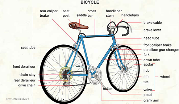
Via the Visual Dictionary.
This observation resonates with a question I have been asked on several occasions by training course delegates. Many express a frustration in their struggle to understand and identify what makes a perfect visualization. By extension, they admit to a difficulty in establishing clarity in their own convictions about judging what is a right way and a wrong way to approach a visualization design.
Entering the field, you begin with fundamentally no informed reasoning for appreciation of quality; it is a gut instinct based on the effect it has on you. Yet, through the influence of reading key articles and exposure to social media, when you see others expressing a conviction, you feel obliged to jump off the fence and hurriedly wave a flag, any flag, of your judgment. It’s not so much a case of following the crowd, rather more about feeling a need to express an opinion as quickly and as clearly as everybody else seems to.
Here’s the truth: Developing clarity of your design conviction is difficult. If it were purely about taste, it would be easier. That’s why you can be much more affirmative about your tastes in things like music, art or movies. “Did it connect with you?” is a very open but fitting question that easily allows you to arrive at a Boolean type of response and the clarity of your judgment.
I recently wrote an article to discuss the visualizations I like. In this piece, I talked much less about style, approach, subjects, technique or principles, but instead focused on those visualizations that give back more in return than you put it. That is my conviction, but it has taken a long while to arrive at that level of clarity. As many others will, I’ve been through a full discovery cycle of liking things that I now don’t like and disliking things that I now do.
This conviction is informed by knowledge, by exposure to other disciplines and methods, and also through greater appreciation of what it takes to craft an effective visualization solution that works for the problem context it is responding to. Fundamentally, this is a hard discipline to do well.
Final thoughts
The balance, fairness and realism of our criticism needs to improve.
The desire of those active “experts” in the field to influence widespread effective practice needs to be matched by a greater maturity and sensitivity in the way we also evaluate the output of this creativity. Moreover, commentators and critics, myself included, need to develop a smarter appreciation of the different contexts in which these works are created.
A creative field, by its very nature, will have many different interpretations and perspectives, and the resolution and richness of this opinion is important to safeguard. Of course, promoting a more open-minded approach to evaluation doesn’t mean to say there should be no critical analysis. We also need to ensure there isn’t too much demonstration of the emperor’s new clothes attitude, especially when a work looks cool or demonstrates impressive technical competence.
There is great importance in having the conviction and confidence to ask the question “so what?,” to engage in constructive and mature critique (for example), and to exhibit a desire to understand and
probe the intention behind all visualisation work. From this, we will all learn so much more and help create an environment that facilitates encouragement rather than discouragement.
This article likely contains some sweeping generalisations that manage to over-simplify things, but hopefully they help illustrate the importance of lifting our heads above the noise and seeing what’s actually going on, who is active in this field, what roles they are taking on and the value they are bringing to the whole visualization ecosystem, not just to the top table.
Fundamentally, what we need to avoid is inadvertently creating barriers to people trying to enter and develop in this field by creating the impression that a 1% missed opportunity is more important than the 99% of a design’s features that were a nailed-on success.
I know I will be making a concerted effort to achieve this balance and fairness in my own analyses.
Associated photo on home and category pages: Library report card–5th grade
 Strata Conference + Hadoop World — The O’Reilly Strata Conference, being held Oct. 23-25 in New York City, explores the changes brought to technology and business by big data, data science, and pervasive computing. This year, Strata has joined forces with Hadoop World.
Related: