
When I wrote that Radar was investigating data journalism and asked for your favorite examples of good work, we heard back from around the world.
I received emails from Los Angeles, Philadelphia, Canada and Italy that featured data visualization, explored the role of data in government accountability, and shared how open data can revolutionize environmental reporting. A tweet pointed me to a talk about how R is being used in the newsroom. Another tweet linked to relevant interviews on social science and the media:
.@digiphile Two interesting academic interviews re: data journalism we did recently: journalistsresource.org/reference/rese… & journalistsresource.org/reference/rese…
— Journalist’sResource (@JournoResource) November 26, 2012
Two of the case studies focused on data visualization, an important practice that my colleague Julie Steele and other editors at O’Reilly Media have been exploring over the past several years.
Several other responses are featured at more length below. After you read through, make sure to also check out this terrific Ignite talk on data journalism recorded at this year’s Newsfoo in Arizona.
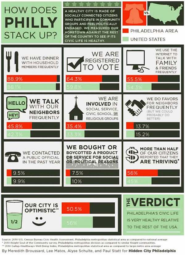
Visualizing civic health
Meredith Broussard, a professor at the University of Pennsylvania, sent us a link to a recent data journalism project she did for Hidden City Philadelphia, which won an award from the National Council on Citizenship and the Knight Foundation. The project, measuring Philadelphia’s civic health, won honorable mention in Knight’s civic data challenge. Data visualization was a strong theme among the winners of that challenge.
Mapping ambulance response times
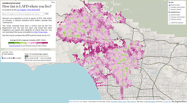
I profiled the data journalism work of The Los Angeles Times earlier this year, when I interviewed news developer Ben Welsh about the newspaper’s Data Desk, a team of reporters and web developers that specializes in maps, databases, analysis and visualization.
Recently, the Data Desk made an interactive visualization that mapped how fast the Los Angeles Fire Department responds to calls.
Visualizing UK government spending
The Guardian Datablog is one of the best sources of interesting, relevant data journalism work, from sports to popular culture to government accountability. Every post demonstrates an emerging practice when its editors make it possible for readers to download the data themselves. Earlier this month, the Datablog put government spending in the United Kingdom under the microscope and accompanied it with a downloadable graphic (PDF).
The Guardian’s data journalism is particularly important as the British government continues to invest in open data. In June, the United Kingdom’s Cabinet Office relaunched Data.gov.uk and released a new open data white paper. The British government is doubling down on the notion that open data can be a catalyst for increased government transparency, civic utility and economic prosperity. The role of data journalism in delivering those outcomes is central.
(Note: A separate Radar project is digging into the open data economy.)
An Italian data job
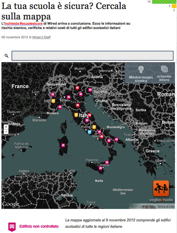
Elisabetta Tola, an Italian data journalist, wrote in to share her work on a series of Wired Magazine articles that feature data on seismic risk assessment in Italian schools. The interactive lets parents search for schools, a feature that embodies service journalism and offers more value than a static map.
The Italian government, while well off the pace set by the UK, has made more open data available since it launched a national platform in 2011.
In this case, however, the only data that the Italian Ministry of Education released was a list of school buildings published online. Tola and her team aggregated or created the rest of the data used in the project, from scraping and munching spending data in published onto regional websites as PDFs to adding geolocation in cooperation with a local developer.
Tola highlighted a key challenge in Italy that exists in many other places around the world: How can data journalism be practiced in countries that do not have a Freedom of Information Act or a tradition of transparency on government actions and spending? If you have ideas, please share them in the comments or email me.
Putting satellite imagery to work
Brazil, by way of contrast, notably passed a freedom of information law this past year, fulfilling one of its commitments to the Open Government Partnership.
Earlier this year, when I traveled to Brazil to moderate a panel at the historic partnership’s annual meeting, I met Gustavo Faleiros, a journalist working with open data focusing on the Amazon rainforest. Faleiros is as a Knight International Journalism Fellow, in partnership with Washington-based organizations International Center for Journalists and Internews. Today, Faleiros continues that work as the project coordinator for InfoAmazonia.org, a beautiful mashup of open data, maps and storytelling.
Faleiros explained that the partnership is training Brazilian journalists to use satellite imagery and collect data related to forest fires and carbon monoxide. He shared this video that shows a data visualization that came out of that work:
As 2012 comes to an end, the rate of Amazon deforestation has dropped to record lows. These tools help the world see what’s happening from high above.
Data-driven broadcast journalism?
I also heard about work in much colder climes when Keith Robinson wrote in from Canada. “As part of large broadcast organizations, one thing that is very satisfying about data journalism is that it often puts our digital staff in the driver’s seat — what starts as an online investigation often becomes the basis for original and exclusive broadcast content,” he wrote in an email.
Robinson, the senior producer for specials and interactive at Global News in Canada, highlighted several examples of their Data Desk’s work, including:
- Mapping and visualizing Canada’s census data
- Combining accident data and pedestrian head counts to find a better way to assess dangerous intersections
- Unpacking 93 years of baby names
- Tracking how voting blocks have changed over the life of the Toronto City Council
- Investigating water main breaks in Toronto and how they’re being addressed
- A feature on Canada’s Remembrance Day
Robinson expects 2013 will see further investment and expansion in the data journalism practice at Global News.
Robinson also pointed to a practice that media should at least consider adopting: Global News is not only consuming and displaying open data, but also publishing the data they receive from the Canadian government. “As we make access to information requests, we’re trying to make the data received available to the public,” he wrote.
From the big picture to next steps
It was instructive to learn more about the work of two large media organizations, the Los Angeles Times and Canada’s Global News, which have been building their capacity to practice data journalism. The other international perspectives in my inbox and tweet stream, however, were a reminder that big-city newsrooms that can afford teams of programmers and designers aren’t the only players here.
To put it another way, acts of data journalism by small teams or individuals aren’t just plausible, they’re happening — from Italy to Brazil to Africa. That doesn’t mean that the news application teams at NPR, The Guardian, ProPublica or the New York Times aren’t setting the pace for data journalism when it comes to cutting edge work — far from it — but the tools and techniques to make something worthwhile are being democratized.
That’s possible in no small part because of the trend toward open source tools and social coding I’m seeing online, from Open Street Map to more open elections.
It’s a privilege to have a global network to tap into for knowledge and, in the best moments, wisdom. Thank you — and please keep the responses coming, whether you use email, Twitter or the phone. Your input is helping shape a report I’m developing that ties together our coverage of data journalism. Look for that to be published early in the new year.
Related