
wefeelfine.org -- Addictive Visualization of Collective Sentiment
Roger Magoulas wrote in email: "The Stamen folks showed me a new visualization app that I had not seen before: wefeelfine.org. Basically, blog data is collected and searched for variants of the phrases 'I feel...' or 'I am feeling...' One of 5,000 predefined feelings is associated with the post and the other database attributes are loaded. The 'mobs' has options to display 'most common' and 'most salient' characteristics of the data. The animation is done in processing." The mission link on the site gives a good summary of what happens next:
The result is a database of several million human feelings, increasing by 15,000 - 20,000 new feelings per day. Using a series of playful interfaces, the feelings can be searched and sorted across a number of demographic slices, offering responses to specific questions like: do Europeans feel sad more often than Americans? Do women feel fat more often than men? Does rainy weather affect how we feel? What are the most representative feelings of female New Yorkers in their 20s? What do people feel right now in Baghdad? What were people feeling on Valentine's Day? Which are the happiest cities in the world? The saddest? And so on.
The interface to this data is a self-organizing particle system, where each particle represents a single feeling posted by a single individual. The particles' properties - color, size, shape, opacity - indicate the nature of the feeling inside, and any particle can be clicked to reveal the full sentence or photograph it contains. The particles careen wildly around the screen until asked to self-organize along any number of axes, expressing various pictures of human emotion. We Feel Fine paints these pictures in six formal movements titled: Madness, Murmurs, Montage, Mobs, Metrics, and Mounds.
At its core, We Feel Fine is an artwork authored by everyone. It will grow and change as we grow and change, reflecting what's on our blogs, what's in our hearts, what's in our minds. We hope it makes the world seem a little smaller, and we hope it helps people see beauty in the everyday ups and downs of life.
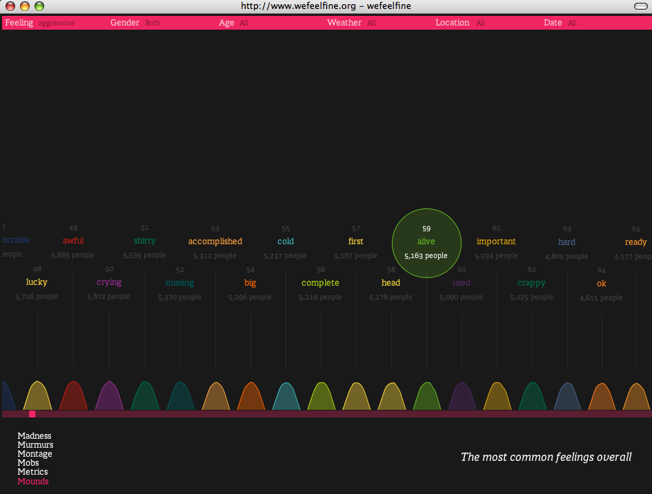
Detail on how to use the app can be found in the summary of the movements. A good place to start is with the Mounds, which shows the relative size of the most commonly expressed feelings. #1 right now is "better," followed by "bad" and "good." But you can scroll horizontally to see that people feel alive (#59) slightly more often than they feel important (#61).
Also very cool as a starting point is Murmurs, which (like the scrolling zeitgeist in Google's lobby) shows a stream of the actual quotes that make up the index.
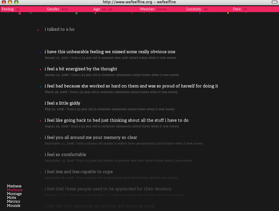
But where it gets even cooler is when you start adjusting factors like age, gender, weather, location, so you can look for things like how people aged 50-59 feel when it's snowy. I have to say that some of these are probably a bit remote from reality, since I doubt that they are able to gather that much unique data on each of these axes, but it's nonetheless addictive. (You can see how many people, genders, age, etc.) are associated with each data slice by choosing mobs, and then selecting the factor in question. Each is neatly visualized. A quick look shows that wefeelfine has detected more women than men, that the greatest proportion are 20-29, and so on.)
The interface is fairly complex -- but play around for a while and you'll get the hang of it. It will be a while before you reach feeling 2178, saturated.
wefeelfine.org is the work of Jonathan Harris and Sep Kemvar. Awesome and inventive. This project also shows the enormous power of processing as a visualization tool.
tags:
| comments: 3
| Sphere It
submit: ![]()
![]()
![]()
![]()
0 TrackBacks
TrackBack URL for this entry: http://blogs.oreilly.com/cgi-bin/mt/mt-t.cgi/5199
Comments: 3
This is hot! Reminds me of the Hope Garden (www.flowersforhope.com) that was a nominee last year at Flash Forward for visualization award.
But I do wonder what kind of stickiness these apps have. They're beautiful and enjoyable, but once you "get" it, there's no way to go deeper--only to gather more data. The gallery of montages starts to get at this by winking at the question--which montages do you value?--but I want more ways to draw linkages, tie it together.
Nice! It reminds me of Digg's real-time stats viewer at Digg Labs: http://labs.digg.com/
Cheers!
Dr.E
Post A Comment:
STAY CONNECTED
RECENT COMMENTS
- DoctorEternal on wefeelfine.org -- Addictive Visualization of Collective Sentiment: Nice! It reminds me of ...
- Nina Simon on wefeelfine.org -- Addictive Visualization of Collective Sentiment: This is hot! Reminds m...
- Andrew on wefeelfine.org -- Addictive Visualization of Collective Sentiment: Nice! Sort of an emerge...
RADAR TOPICS
Andrew [01.29.07 04:23 PM]
Nice! Sort of an emergent version of Cuban Council's old Moodstats application.