- Seven Foundational Visualization Papers — seven classics in the field that are cited and useful again and again.
- Git Immersion — a “walking tour” of Git inspired by the premise that to know a thing is to do it. Cf Learn Python the Hard Way or even NASA’s Planet Makeover. We’ll see more and more tutorials that require participation because you don’t get muscle memory by reading. (NASA link via BoingBoing
- Readability — strips out ads and sends money to the publishers you like. I’d never thought of a business model as something that’s imposed from the outside quite like this, but there you go.
- Quora’s Technology Examined (Phil Whelan) — In this blog post I will delve into the snippets of information available on Quora and look at Quora from a technical perspective. What technical decisions have they made? What does their architecture look like? What languages and frameworks do they use? How do they make that search bar respond so quickly? Lots of Python. (via Joshua Schachter on Delicious)
"visualizations" entries

Top Stories: September 5-9, 2011
Hacking a Texas city, RIP Michael S. Hart, and the bar is raised for open gov visualizations.
This week on O'Reilly: Christopher Groskopf explained how he's going to hack a Texas city, Nat Torkington said goodbye to Project Gutenberg founder Michael S. Hart, and the value of government data visualizations reached a new standard thanks to LookatCook.com.

The nexus of data, art and science is where the interesting stuff happens
Data artist Jer Thorp on working at the New York Times and the aesthetics of data.
Jer Thorp, data artist in residence at the New York Times, sits at the crossroads of data, art and science. Here he discusses his work at the Times and, more broadly, how aesthetics shape our understanding of data.

Four Short Links: 2 February 2011
Visualization Papers, Immersive Learning, Readability, and Quora's Technology
Four short links: 27 January 2011
New Browser, Google APIs, NFC Checkin, and XSS Prevention
- Mozilla Home Dash — love this experiment in rethinking the browser from Mozilla. They call it a “browse-based browser” as opposed to “search-based browser” (hello, Chrome). Made me realize that, with Chrome, Google’s achieved a 0-click interface to search–you search without meaning to as you type in URLs, you see advertising results without ever having visited a web site.
- Periodic Table of Google APIs — cute graphic, part of a large push from Google to hire more outreach engineers to do evangelism, etc. The first visible signs of Google’s hiring binge.
- NFC in the Real World (Dan Hill) — smooth airline checkin with fobs mailed to frequent fliers.
- XSS Prevention Cheat Sheet (OWASP) — HTML entity encoding doesn’t work if you’re putting untrusted data inside a script tag anywhere, or an event handler attribute like onmouseover, or inside CSS, or in a URL. So even if you use an HTML entity encoding method everywhere, you are still most likely vulnerable to XSS. You MUST use the escape syntax for the part of the HTML document you’re putting untrusted data into. That’s what the rules below are all about. (via Hacker News)

3 skills a data scientist needs
LinkedIn's Pete Skomoroch on the key capabilities of data scientists.
In this brief video interview, LinkedIn senior research scientist Pete Skomoroch reveals the three core skills of data scientists.

Visualization deconstructed: Mapping Facebook's friendships
A deep look at Paul Butler's popular Facebook visualization.
Paul Butler's visualization of Facebook friendships turned a lot of heads recently, and rightfully so. It shows a fascinating connection between virtual relationships and the physical world.
Visualization deconstructed: Mapping Facebook’s friendships
A deep look at Paul Butler's popular Facebook visualization.
Paul Butler's visualization of Facebook friendships turned a lot of heads recently, and rightfully so. It shows a fascinating connection between virtual relationships and the physical world.
Visualization deconstructed: New York Times “Mapping America”
A look at what works in a census visualization.
In this first post in a new series on data visualization, Sébastien Pierre takes a close look at the New York Times' "Mapping America" interactive census map.
Visualization deconstructed: New York Times "Mapping America"
A look at what works in a census visualization.
In this first post in a new series on data visualization, Sébastien Pierre takes a close look at the New York Times' "Mapping America" interactive census map.
Four short links: 31 December 2010
Statistics, Tech Writing, Shared Spaces, and Delicious Exodus
- The Joy of Stats — Hans Rosling’s BBC documentary on statistics, available to watch online.
- Best Tech Writing of 2010 — I need a mass “add these to Instapaper” button. (via Hacker News)
- Google Shared Spaces: Why We Made It (Pamela Fox) — came out of what people were trying to do with Google Wave.
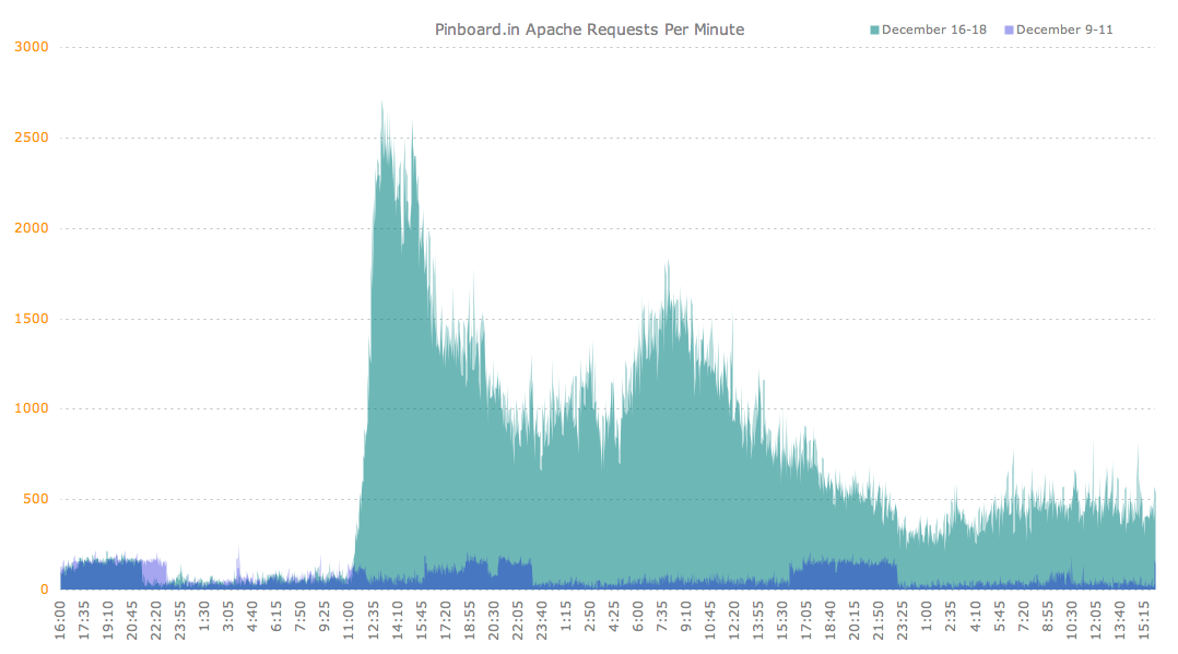
- The Great Delicious Exodus — traffic graph as experienced by pinboard.