- Militarizing Your Backyard With Python and Computer Vision (video) — using a water cannon, computer video, Arduino, and Python to keep marauding squirrel hordes under control. See the finished result for Yakkity Saxed moist rodent goodness.
- Soundbite — dialogue search for Apple’s Final Cut Pro and Adobe Premiere Pro. Boris Soundbite quickly and accurately finds any word or phrase spoken in recorded media. Shoot squirrels with computer vision, search audio with computer hearing. We live in the future, people. (via Andy Baio)
- Single Page Apps with Backbone.js — interesting and detailed dissection of how one site did it. Single page apps are where the server sends back one HTML file which changes (via Javascript) in response to the user’s activity, possibly with API calls happening in the background, but where the browser is very definitely not requesting more full HTML pages from the server. The idea is to have speed (pull less across the wire each time the page changes) and also to use the language you already know to build the web page (Javascript).
- Why Finish Books? (NY Review of Books) — the more bad books you finish, the fewer good ones you”ll have time to start. Applying this to the rest of life is left as an exercise for the reader.
"web design" entries

CSS Grid Layout: The modern way of doing layout on the Web
The O'Reilly Radar Podcast: Rachel Andrew on modern Web layout, and Kyle Simpson defends JavaScript Coercion.

Subscribe to the O’Reilly Radar Podcast to track the technologies and people that will shape our world in the years to come.
In this week’s episode of the Radar Podcast, O’Reilly’s Mac Slocum chats with Rachel Andrew, founder of edgeofmyseat.com, about CSS Grid Layout and the role responsive design is playing in emerging Web technologies.
In 2004, Andrew published The CSS Anthology: 101 Essential Tips, Tricks & Hacks. Through the years of revisions, she noted in the interview, not that much has changed; sure, we’ve moved on from Netscape 4, she said, but “the [layout] methods we’re using haven’t moved on much since I wrote that book, which is kind of terrifying.” This is why Andrew is so excited about CSS Grid Layout, which she sees as bringing Web layout into the modern day:
CSS Grid Layout is a new spec, an emerging spec. It originally came from Microsoft. In fact, there’s an early implementation of it in IE 10 and 11. It’s kind of moved on now. It’s really a specification for laying out Web pages and/or applications. It’s something that we haven’t really had up to now. The specs and the sort of things that we’re using for layout, things like float and so on, really are quite like hacks to get them to work. Developers have been working around this stuff for years. Grid, I’m quite excited about because it’s sort of the first time it feels like a really modern way of doing layout on the Web.

Not just the government’s playbook
The 13 principles in the U.S. CIO's Digital Services Playbook are applicable for everyone.

Whenever I hear someone say that “government should be run like a business,” my first reaction is “do you know how badly most businesses are run?” Seriously. I do not want my government to run like a business — whether it’s like the local restaurants that pop up and die like wildflowers, or megacorporations that sell broken products, whether financial, automotive, or otherwise.
If you read some elements of the press, it’s easy to think that healthcare.gov is the first time that a website failed. And it’s easy to forget that a large non-government website was failing, in surprisingly similar ways, at roughly the same time. I’m talking about the Common App site, the site high school seniors use to apply to most colleges in the US. There were problems with pasting in essays, problems with accepting payments, problems with the app mysteriously hanging for hours, and more.

HTML and CSS performance
Efficient, reusable markup reduces development work while boosting page load time
[Ed note: This is the third in a series of posts on web design and performance. You can see the first two posts here and here.]
Optimizing your markup can have a substantial impact on your site’s page load time. Bloated HTML leads to bloated CSS, and vice-versa. For example, during a semantics and reusability template cleanup, I was able to significantly reduce the file size of site-wide HTML, CSS, and stylesheet images.
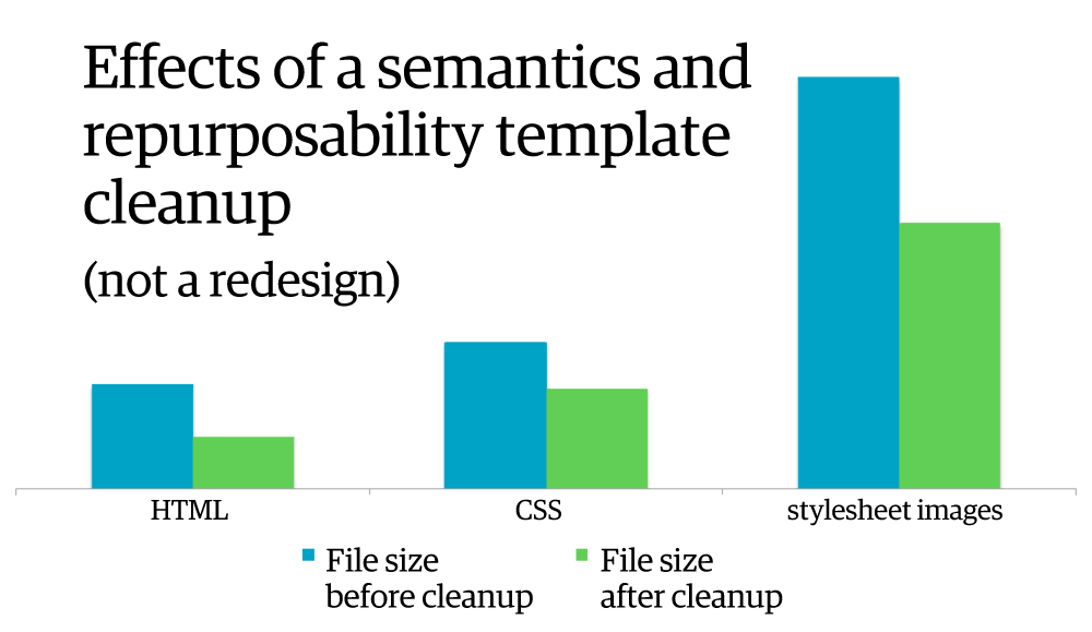
I achieved this by simply renaming existing elements to have more semantic meaning and then removed unnecessary elements in the HTML (also known as divitis) to focus on reusability. Later in the same cleanup effort, I was able to cut CSS by 39% by removing unused selectors, combining and condensing styles, and normalizing the colors used across the site.
Image performance
Optimizing images is likely the biggest win for performance on your site
[Ed note: This is the second in a series of posts on web design and performance. You can see the introductory post here.]
Images make up the majority of most sites’ page weight. Thanks to their size and the number of image requests made by an average site, optimizing images is arguably the easiest big win when it comes to improving your site’s page load time.

Let’s start by looking at the various image types available, and then work through the various options you have for optimizing them.

The altar of shiny
Web design trends often carry hefty performance costs
Web and mobile users continue to expect faster sites and apps–especially when it comes to mobile–and this year I’d like to see people who work on the web spend more time focusing on performance as a user experience priority instead of chasing trends.
I recently ran across this article in Forbes, which lists a number of web design goals/trends that Steve Cooper is eyeing for a site redesign of online magazine Hitched. My intention is not to pick on Hitched or Cooper per se, but the list is a molotov cocktail of potential performance woes:
- Continuous scrolling
- Responsive design
- Parallax sites
You can use most of those techniques without creating performance nightmares, but it is unfortunately rare. I feel like I’m living in an alternate reality where I’m hearing that users want simpler, faster sites, and yet the trends in web design are marching in the opposite direction.

What Developers Can Learn from Healthcare.gov
Remember, even a failure can serve as an example of what not to do
The first highly visible component of the Affordable Health Care Act launched this week, in the form of the healthcare.gov site. Theoretically, it allows citizens, who live in any of the states that have chosen not to implement their own portal, to get quotes and sign up for coverage.
I say theoretically because I’ve been trying to get a quote out of it since it launched on Tuesday, and I’m still trying. Every time I think I’ve gotten past the last glitch, a new one shows up further down the line. While it’s easy to write it off as yet another example of how the government (under any administration) seems to be incapable of delivering large software projects, there are some specific lessons that developers can take away.

Purposeful Design Principles for Behavior Change
How to design products and services that help users change behavior
Steve Wendel (@sawendel) is the Principal Scientist at HelloWallet where he develops applications that help users take control of their finances. He’s also currently writing Designing for Behavior Change. I recently sat down to talk with Steve about the importance of testing and iteration, role of psychology, and resources and tools.
Key highlights include:

Optimizing Your Websites for Smartphones, Tablets, and More
How to "future-proof" your sites
Users expect to be able to use and bookmark a website by name—always the same name, regardless of the device used to reach and view the site. From a user’s standpoint, a site is a site regardless of which device is being used to reach it. The code that backs up the site should be smart enough to detect the requesting device and intelligently serve the most appropriate markup.
There are several ways to achieve this goal, and at least three realistic scenarios.
Distinct Sites for Mobile and Desktop
Modern websites are built around the typical size of a desktop or laptop monitor. In fact, until the advent of iPhones, web developers rarely considered the need to fit web content into different sizes. Now, however, establishing an effective presence on mobile devices is a necessity. Just because your websites can be accessed by smartphones and tablets doesn’t make them effective. To provide an effective experience, you must optimize your sites for specific classes of devices—typically, smartphones and tablets. For quite some time, it seemed that distinct “m”-sites were a good-enough solution. For example, the website at www.somecompany.com was available in mobile-optimized form using the URL m.somecompany.com. In terms of development, the two sites are completely different; they were projects that simply shared some portions of the back end.
Read more…

Four short links: 16 March 2012
Squirrel Targeting with Computer Vision, Audio Recognition, Single Page Apps, and Persisting at Failing
Four short links: 8 March 2012
Compete on Convenience, Minimal Viable Operating System, Awesome Font, Collaboration Integration
- Add Torrent Links to IMDB (Userscripts) — a glimpse at what the Internet could look like: from the site you research movies on, with one click you could then launch the download. If only the company that ran the movie research site had rights to the OneClick patent and the ability to offer movies for download. Oh wait, those aren’t the barriers. If only the movie companies would cease being nutjobs insisting on flogging their DRM-hobbled nags when the black market has x264 racehorses for less. They’re not competing on price, they’re not competing on convenience, they’re competing on the expected value of litigation. Now *that’s* a business model!
- JeOS — I hadn’t heard this term before: Just Enough Operating System. Take a standard distro, and strip it down to the bare essentials that you actually need.
- Font Awesome — a font with a zillion pictograms and icons. “An iconic font designed for use with Twitter Bootstrap”.
- Collabograte — a collection of integration recipes for collaboration tools so you aren’t broken on the “how do I get this thing set up with LDAP auth?” wheel which others have reinvented with their nose to the mixed metaphor grindstone. (via Kartik Subbarao)