
One of the most fascinating presentations at our recent Foo Camp was one on visualization. A number of different folks ran through some of their visualization projects. There was a lot of mindblowing stuff, but what particularly struck me was the similarity between a visualization that Fernanda Viegas had done (with Martin Wattenberg) visualizing the change logs in wikipedia entries and one that Ben Fry had done on Single Nucleotide Polymorphism, or SNPs, (comparisons of the genetic varation between individuals.) While the similarities may simply be an artifact of a similar visualization technique, they are striking and thought-provoking, and suggest the organic nature of wikipedia.
Here’s one of the “<a href=history flow” images showing how a wikipedia entry changes over time. (Check out the whole gallery. Some of them are very beautiful.) Interestingly, the image in the gallery that is most similar to the SNP visualization is an entry on abortion, which, being a controversial subject, doesn’t just grow over time like many wikipedia entries, but has many deletions, moves, and other changes. So perhaps controversy forces evolution :-)

And here’s one of Ben’s SNP visualizations:
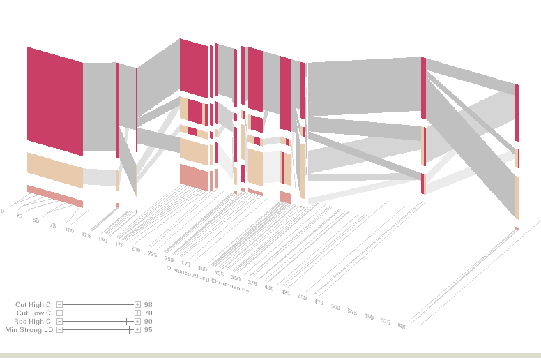
For a bit more detail:
Explaining his visualization, Ben writes: “When comparing the genome of two different people, you’ll see single letter changes (called SNPs, pronounced “snips”) every few thousand letters. An interesting feature of SNPs is that their ordering has distinct patterns, where sets of consecutive changes are most often found together. There are many methods for looking at this data, so this piece combines several of them into a single visual display. The project is described in greater detail in my dissertation [PDF], starting in chapter four.”
Fernanda and Martin explain their technique here.