As I wrote last year, computer book sales are a pretty good technology trend indicator. The books people buy say something about the technologies they are trying to learn about, and often tell a story that analysts using more traditional metrics might miss. (For example, I organized the open source summit in 1998 after noticing that all of my 1997 bestsellers had something in common!)
At this point, we have a rich data set to work from. We get weekly point-of-sale data from all major retailers, for all publishers, via Nielsen BookScan‘s top 10,000 computer books service, load it into a MySQL data mart, and then do analysis and visualization of the data. I periodically do technology alerts based on this information (see 1, 2, and 3 for examples), but it occurred to me that I really ought to do a regular quarterly update on the state of the entire market. Note that this is US data only. I’ll report later on the UK market.
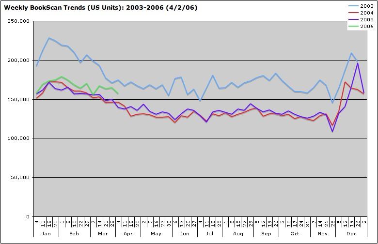
The quick headline: the market has turned around, and we’re seeing the first sustained computer book upturn since the dot-com collapse in 2001. The figure below shows the overall sales trend from 2003 through the first quarter of of 2006.
As you can see, there’s a clear seasonal pattern, with the graphs for each year closely mirroring the year before, with remarkably consistent weekly ups and downs. While our detailed data only goes back to 2003, we know that 2003 was about 20% lower than 2002, which was in turn 20% lower than 2001. 2004 was then 20% lower than 2003…but that represented the low water mark. 2005 saw a slight upturn, and that has strengthened in 2006, with sell through of technical books in Q1 of 2006 up nearly 7% over the same period in 2005.
The devil of course is in the details, and when comparing the performance of thousands of books, it helps to have a good visualization tool. A treemap, originally developed at the University of Maryland, is a great way to look at a huge data set that is organized into hierarchical categories. In this type of visualization, the size of a square shows the magnitude of a category, while the color shows the rate of change. Red is down, and green is up, with the intensity of the color representing the magnitude of the change. (For more background on how we categorize the data and use this visualization, see this previous posting.) Here’s a treemap showing gains and losses by category, comparing the first quarter of 2006 with the first quarter of 2005. Click on the thumbnail below to pop up a larger image in another window.
As you can see, the gains are not in all categories. The biggest increases are in the areas of web design and development (up 25%) and digital media applications (up 14%.) Books on consumer operating systems are off by 5%, with books on Windows XP off by a full 17%. Core software development technologies are up 4%. But even there, the gains are not evenly distributed. Java, Perl and C++ are down, C#, Python, and Ruby are up. Red Hat is down, and other Linux distributions are up. In part 2, tomorrow, I’ll drill down into the winners and losers by category.
A few other significant tidbits:
- The concentration of sales in the bestseller list is increasing, with the unit sales of the top 50 books growing at 3x the rate of the market as a whole, the top 100 growing at 2x the rate. By the time you consider the top 500, you’re close to the overall rate of increase for the market. This may be a result of retailer concentration — the independent computer bookstores that used to support deep backlist and niche titles are now mostly gone, while the top titles, mostly concentrated in consumer areas, have always been strongest at the chains.
- The number of new titles appearing on the BookScan Top 3000 for the first time in Q1 of each year has declined; this may indicate the start of a trend towards fewer titles due to technical publisher consolidation and cutbacks: in 2004, there were 625 new titles; in 2005, 525; in 2006, 510.
Tomorrow: Category Winners and Losers


