
In the past, we accepted certain limitations in mobile content and speed because it was the actual, real web on a mobile device! But as Strangeloop president Joshua Bixby (@joshuabixby) notes in the following interview, that mode of thinking is on its way out. Now, most customers expect a full and fast web experience whether they’re on a desktop, tablet or phone. The companies that offer that are poised to succeed. And for those that don’t, ridicule will be the least of their concerns.
Should companies be thinking “mobile first” now?
 Joshua Bixby: We talk about “the web” and “the mobile web” as if the two are different, but they aren’t. I’m the first to admit that I’m as guilty of doing this as the next person. Using these terms is helpful for discussing differences in how people browse via different devices, but at the end of the day, it’s all one web. Users want the same breadth and depth of content, no matter what device they’re using. They want a consistent, reliable user experience. They don’t want to interact with your site one way at their desks, then learn a whole new way when they’re tablet-surfing on the couch, and then learn a third way when they’re roaming around with their phones. Site owners who can deliver an experience that feels the same, regardless of the platform, are the ones who are going to own the web of the not-too-distant future.
Will all phones be smartphones at some point? Or will non-smartphones remain an important segment for years to come?
Joshua Bixby: It really depends on which market you look at. Last summer, comScore published a survey that showed that, despite the rapid rate of smartphone adoption, 155 million American mobile phone users still don’t have smartphones. That’s obviously a pretty significant number. But if you take a global view, things flip around and we see that, especially in developing countries, new mobile users are jumping right on the smartphone wagon. This allows users to bypass both dumb phones and the desktop web. It’s a whole different way of interacting with the Internet.
I think an even better question might be: How great a disruptor will tablets be to the mobile market? Site owners have been caught with their mobile pants down, so to speak, in their inability to recognize the importance of this market. Forrester did a survey of retailers and found that, on average, about 20% of holiday mobile traffic came via tablets, with some retailers reporting that more than half their mobile traffic came via tablets. But most “mobile-optimized” sites look terrible on tablets. In 2012, site owners are going to be scrambling to catch up with this paradigm shift.
Should mobile app development be prioritized over mobile site development?
Joshua Bixby: Mobile apps will continue to have a role for repeat, loyal users of an online store or service, but it’s incredibly narrow-sighted of companies to focus on app development over site development. People are always going to want to access the full public Internet. It’s circa-1995, AOL-style thinking to assume otherwise.
I’ve seen scenario after scenario where apps present a huge usability problem because they don’t anticipate the various ways that the web and apps intersect. Media sites are some of the worst culprits. Here’s a common scenario: You’re checking your Twitter feed and click on a link, but instead of taking you to the article, you’re funneled to an intermediary “download our app” page. Often, this is a demand, not a request. There’s no way to bypass this app block. And then say you do download the app — after it’s installed, you don’t even get served the article you originally wanted to see. You just get served the home page of the site, so you have to go back to Twitter and find the original link again.
This is just one scenario, but there are plenty more, and they all highlight the fact that many site owners don’t recognize the complexity of mobile user paths through the web.
What are the most important mobile key performance indicators (KPIs)? How do these differ from the KPIs of traditional websites?
Joshua Bixby: This really depends on the type of site. Obviously, for ecommerce sites, you’re always going to care about revenue and conversion, but these aren’t necessarily as important for mobile as for desktop traffic. For all you know, your mobile user is standing in your bricks-and-mortar store doing some price-checking or reading product reviews. They’re going to convert in your store. For these users, what you care about is engagement, not conversions, which is where KPIs like bounce rate and page views come in.
Site owners should look closely at bounce rate, page views, and time on page for their mobile traffic. These numbers should be commensurate with their desktop traffic. If they’re way off — say you’re averaging 2.3 page views per mobile visitor and 5.9 page views per desktop visitor — that could be an indicator that the mobile site is doing something to drive users away. In that case, you should analyze how fast your pages are loading or how usable they are.
Does a one-second delay on the mobile side have more significant repercussions than a one-second delay on the desktop side?
Joshua Bixby: I’m in the process of researching this very question. I recently did some fairly exhaustive analysis of mobile KPIs for a couple of Strangeloop’s customers, which involved looking at more than 500,000 unique visits and analyzing how page load time affected metrics like conversion, abandonment rate, cart size, and page views. I presented my findings at Velocity Europe and Velocity Berlin. When I got back home, I asked myself, “Why didn’t I compare these numbers against some kind of desktop baseline?” So I’m doing that now. I’ll be happy to share my findings when I’m done.
Have you found that users of one type of mobile OS or device are more accepting of delays than others?
Joshua Bixby: This is a really neat area of research, and one that we’ve only begun to explore. In the mobile research I just mentioned, we did a little experiment where we used network quality as a proxy for performance. The reason for doing this was to try to get a sense of what major changes in page load — say the difference between pages that load in six seconds versus pages that load in 20-plus seconds — do to metrics. We found a few interesting things.
To start, when it comes to bounce rate, we found that iPad users have about the same bounce rate as Android and iPhone users — about 22-24% — when pages are served slowly to all three groups (iPad, iPhone and Android). But speeding pages up had a much greater impact on the iPad group than it did on the other two groups: The iPad users’ bounce rates dropped to around 5%, compared to 8% for iPhone users and 11% for Android users.
What this means is anyone’s guess, but I’d conjecture that the iPad experience is probably more conducive to extended browsing, so iPad users are more likely to stick around once they’re confident that they’ll get a reasonable user experience. Or maybe it’s because iPad users are more likely to be sitting at home on their couch, while smartphone users are more likely to be out and about.
What are the most common mobile optimization mistakes? How should they be addressed?
Joshua Bixby: The most common mistake I see is when site owners aggressively optimize their sites for very specific platforms. There’s a blog that I’m kind of addicted to called WTF Mobile Web, that is filled with examples of this from companies that should probably know better. For example, if you go to Canon’s site on your iPad, you’re served a fixed-width site that takes up about two-fifths of the screen. If I’m using a tablet, I’ve got a big shiny screen. I want to see pictures and rich content.
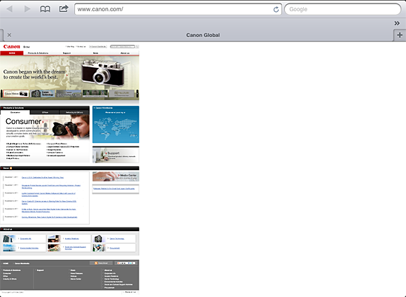
Something seems to be missing … Canon.com fails to take full advantage of the iPad’s screen size.
Speaking of stripped-down sites, there’s such a thing as being too stripped down. The overly minimalist look of so many “mobile-optimized” pages was an understandable reaction to the wave of complaints about pages being too busy on mobile devices. But the bare-bones menu concept is not a solution. People expect more from websites in the aesthetic sense, and they want more than a plain column of buttons.
Here’s one last complaint: “Mobile-optimized” sites that contain a “See full site” link, but then after you click on it, it’s impossible to return to the mobile version. This has happened to me a couple of times, and it’s kind of maddening. When you’re used to the relative ease and fluidity of the web, these rabbit holes are hard to accept.
What’s your take on the Kindle Fire and the Silk browser?
Joshua Bixby: The Kindle Fire and the Silk browser are really fascinating developments because they represent the truly out-of-the-box thinking that’s going to usher in the next phase of aggressive performance optimization. That said, I don’t think they’re going to radically change the landscape in and of themselves.
We all got excited when Amazon described Silk’s so-called “split browser” design — the fact that Silk can offload complex browser tasks to Amazon’s cloud, resulting in dramatically faster load times. The logical next questions became: Will there be any imitators among the other browser vendors? Does the split-browser concept represent a new direction for browsers? The short answer to both questions is “no,” at least for 2012.
For starters, there are privacy concerns surrounding the fact that this kind of split architecture has the potential to capture private user data. And while Silk offers a performance boost for some tablet content, even its own product manager, Brett Taylor, says of tablet browsing, “It’s not meant to process and crunch a lot of heavy data.”
Basic optimization techniques — such as those embedded in Silk — that transform code on a per-page basis to render pages faster in the browser, can actually slow down, or even break, pages. Web pages are becoming even more complex, data-intensive, and dynamic. For now, advanced content optimization — which takes a big-picture approach to accelerating an entire site — is still the only reliable way to radically optimize sites without causing harm.
Since we’re in the midst of the holiday shopping season, what role do you see mobile playing this year?
Joshua Bixby: The 2011 holiday shopping season has proven that the mobile web is no longer a curiosity: 15.2% of online traffic came from mobile devices on Thanksgiving Day, more than double the previous year. Not only were these mobile shoppers spending money, they spent more on average — particularly shoppers using iPads — than desktop shoppers. This will be a wake-up call to retailers. Rather than keeping mobile on the sideline, companies will grow their mobile teams to match the size and scope of their regular development teams.
Related: