- Dataflow Computers: Their History and Future (PDF) — entry from 2008 Wiley Encyclopedia of Computer Science and Engineering.
- Mirador — open source tool for visual exploration of complex data sets. It enables users to discover correlation patterns and derive new hypotheses from the data.
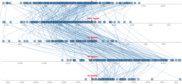
- How 23AndMe Got Regulatory Approval Back (Fast Company) — In order to meet FDA requirements, the design team had to prove that the reports provided on the website would be comprehensible to any American consumer, regardless of their background or education level. And you thought YOUR design brief was hard.
- Getting Comfortable with Uncertainty (The Atlantic) — We have this natural distaste for things that are unfamiliar to us, things that are ambiguous. It goes up from situational stressors, on an individual level and a group level. And we’re stuck with it simply because we have to be ambiguity-reducers.
"visualization" entries

Four short links: 26 October 2015
Dataflow Computers, Data Set Explorer, Design Brief, and Coping with Uncertainty
Four short links: 31 July 2015
Robot Swarms, Google Datacenters, VR Ecosystem, and DeepDream Visualised
- Buzz: An Extensible Programming Language for Self-Organizing Heterogeneous Robot Swarms (arXiv) — Swarm-based primitives allow for the dynamic management of robot teams, and for sharing information globally across the swarm. Self-organization stems from the completely decentralized mechanisms upon which the Buzz run-time platform is based. The language can be extended to add new primitives (thus supporting heterogeneous robot swarms), and its run-time platform is designed to be laid on top of other frameworks, such as Robot Operating System.
- Jupiter Rising: A Decade of Clos Topologies and Centralized Control in Google’s Datacenter Network (PDF) — Our datacenter networks run at dozens of sites across the planet, scaling in capacity by 100x over 10 years to more than 1Pbps of bisection bandwidth. Wow, their Wi-Fi must be AMAZING!
- Nokia’s VR Ambitions Could Restore Its Tech Lustre (Bloomberg) — the VR ecosystem map is super-interesting.
- Visualising GoogleNet Classes — fascinating to see squirrel monkeys and basset hounds emerge from nothing. It’s so tempting to say, “this is what the machine sees in its mind when it thinks of basset hounds,” even though Boring Brain says, “that’s bollocks and you know it!”
Four short links: 16 June 2015
Accessibility Testing, Time-Series Graphing, NO BUBBLE TO SEE HERE, and Technical Documentation
- axe — accessibility testing of web apps, so you can integrate accessibility testing into your continuous EVERYTHING pipeline.
- metrics-graphics — Mozilla Javascript library optimized for visualizing and laying out time-series data.
- US Tech Funding: What’s Going On? (A16Z) — deck eloquently arguing that this is no bubble.
- Teach Don’t Tell — what I think good documentation is and how I think you should go about writing it. Sample common sense: This is obvious when you’re working face-to-face with someone. When you tell them how to play a C major chord on the guitar and they only produce a strangled squeak, it’s clear that you need to slow down and talk about how to press down on the strings properly. As programmers, we almost never get this kind of feedback about our documentation. We don’t see that the person on the other end of the wire is hopelessly confused and blundering around because they’re missing something we thought was obvious (but wasn’t). Teaching someone in person helps you learn to anticipate this, which will pay off (for your users) when you’re writing documentation.

Telling your data’s story
How storytelling can enhance the effectiveness of your visualizations.
Editor’s note: this post is part of our investigation into Big Data Design and Social Science. Michael Freeman covers the use of storytelling frameworks in visualizations in his new tutorial video “Using Storytelling to Effectively Communicate Data.”
Visualizing complex relationships in big data often requires involved graphical displays that can be intimidating to users. As the volume and complexity of data collection and storage scale exponentially, creating clear, communicative, and approachable visual representations of that data is an increasing challenge. As a data visualization specialist, I frightened one of my first sets of collaborators when I suggested using this display:
What I had failed to communicate was that we would use a story structure to introduce audiences to the complex layout (you can see how I did it here).
This image captures three emerging limitations in big data visualization:
- Unclear visual encodings: People don’t know what each visual symbol represents
- Too much data: The volume of information displayed is overwhelming
- Too many variables: Simultaneous encodings of color, position, size, etc. precludes fully understanding each dimension

Use data or be data
Trina Chiasson argues that data has arrived at the same threshold as coding: code or be coded; learn to use data or be data.

Trina Chiasson
Arguments from all sides have surrounded the question of whether or not everyone should learn to code. Trina Chiasson, co-founder and CEO of Infoactive, says learning to code changed her life for the better. “These days I don’t spend a lot of time writing code,” she says, “but it’s incredibly helpful for me to be able to communicate with our engineers and communicate with other people in the industry.”
Though helpful for her personally, she admits that it takes quite a lot of time and commitment to learn to code to any level of proficiency, and that it might not be the best use of time for everyone. What should people commit time to learn? How to use data. Read more…
Four short links: 15 September 2014
Weird Machines, Libraries May Scan, Causal Effects, and Crappy Dashboards
- The Care and Feeding of Weird Machines Found in Executable Metadata (YouTube) — talk from 29th Chaos Communication Congress, on using tricking the ELF linker/loader into arbitrary computation from the metadata supplied. Yes, there’s a brainfuck compiler that turns code into metadata which is then, through a supernatural mix of pixies, steam engines, and binary, executed. This will make your brain leak. Weird machines are everywhere.
- European Libraries May Digitise Books Without Permission — “The right of libraries to communicate, by dedicated terminals, the works they hold in their collections would risk being rendered largely meaningless, or indeed ineffective, if they did not have an ancillary right to digitize the works in question,” the court said. Even if the rights holder offers a library the possibility of licensing his works on appropriate terms, the library can use the exception to publish works on electronic terminals, the court ruled. “Otherwise, the library could not realize its core mission or promote the public interest in promoting research and private study,” it said.
- CausalImpact (GitHub) — Google’s R package for estimating the causal effect of a designed intervention on a time series. (via Google Open Source Blog)
- Laws of Crappy Dashboards — (caution, NSFW language … “crappy” is my paraphrase) so true. Not talking to users will result in a [crappy] dashboard. You don’t know if the dashboard is going to be useful. But you don’t talk to the users to figure it out. Or you just show it to them for a minute (with someone else’s data), never giving them a chance to figure out what the hell they could do with it if you gave it to them.

Building pipelines to facilitate data analysis
A new operator from the magrittr package makes it easier to use R for data analysis.

In every data analysis, you have to string together many tools. You need tools for data wrangling, visualisation, and modelling to understand what’s going on in your data. To use these tools effectively, you need to be able to easily flow from one tool to the next, focusing on asking and answering questions of the data, not struggling to jam the output from one function into the format needed for the next. Wouldn’t it be nice if the world worked this way! I spend a lot of my time thinking about this problem, and how to make the process of data analysis as fast, effective, and expressive as possible. Today, I want to show you a new technique that I’m particularly excited about.
R, at its heart, is a functional programming language: you do data analysis in R by composing functions. However, the problem with function composition is that a lot of it makes for hard-to-read code. For example, here’s some R code that wrangles flight delay data from New York City in 2013. What does it do? Read more…

5 reasons to learn D3
D3 doesn’t stand for data-design dictator
Designers and developers making data visualizations on the web are buzzing about d3.js. But why? Read more…
Four short links: 11 February 2014
Shadow Banking, Visualization Thoughts, Streaming Video Data, and Javascript Puzzlers
- China’s $122BB Boom in Shadow Banking is Happening on Phones (Quartz) — Tencent’s recently launched online money market fund (MMF), Licai Tong, drew in 10 billion yuan ($1.7 billion) in just six days in the last week of January.
- The Weight of Rain — lovely talk about the thought processes behind coming up with a truly insightful visualisation.
- Data on Video Streaming Starting to Emerge (Giga Om) — M-Lab, which gathers broadband performance data and distributes that data to the FCC, has uncovered significant slowdowns in throughput on Comcast, Time Warner Cable and AT&T. Such slowdowns could be indicative of deliberate actions taken at interconnection points by ISPs.
- Javascript Puzzlers — how well do you know Javascript?
Four short links: 17 January 2014
Remote Working, Google Visualizations, Sensing Gamma Rays, and Cheap GPS For Your Arduino
- Making Remote Work — The reality of a remote workplace is that the connections are largely artificial constructs. People can be very, very isolated. A person’s default behavior when they go into a funk is to avoid seeking out interactions, which is effectively the same as actively withdrawing in a remote work environment. It takes a tremendous effort to get on video chats, use our text based communication tools, or even call someone during a dark time. Very good to see this addressed in a post about remote work.
- Google Big Picture Group — public output from the visualization research group at Google.
- Using CMOS Sensors in a Cellphone for Gamma Detection and Classification (Arxiv) — another sense in your pocket. The CMOS camera found in many cellphones is sensitive to ionized electrons. Gamma rays penetrate into the phone and produce ionized electrons that are then detected by the camera. Thermal noise and other noise needs to be removed on the phone, which requires an algorithm that has relatively low memory and computational requirements. The continuous high-delta algorithm described fits those requirements. (via Medium)
- Affordable Arduino-Compatible Centimeter-Level GPS Accuracy (IndieGogo) — for less than $20. (via DIY Drones)