
This post is part of a new series exploring visualizations. Some weeks we’ll point the way to intriguing examples we find in our web travels. Other times we’ll dive into our own datasets and imagery. We’re always looking for leads, so please drop us a line if there’s a visualization you think we should know about.
New York Magazine has long published its Approval Matrix as a way of visualizing its assessments of various pop cultural phenomenon, from high brow to low brow on the vertical scale and from brilliant to desperate on the horizontal scale.
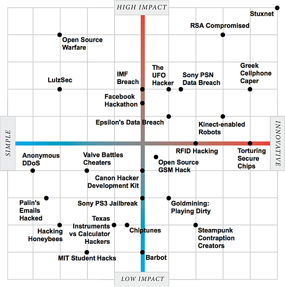
Now, the technology magazine IEEE Spectrum has released its own visualization — “The Two Faces of Hacking” — using a similar sort of scale, but one that depicts not great (or awful) movies, but good, bad and neutral hacks.
“We took 25 of the biggest and best stories and assessed them along two dimensions: innovation and impact,” writes IEEE. “Whether you agree with our assessments or not, we’d like to hear what you think.”
Click for the interactive visualization.
Indeed, rating hacks this way raises a number of interesting questions: What constitutes a “good” hack? Is it motive? Is it skill? Is it the obtaining of a certain amount of attention or media buzz?
More broadly, what does it mean to visualize material on this sort of scale? Does it make recent hacks understandable by the general population? Or does it still assume a certain amount of insider knowledge (arguably, just as New York Magazine’s film assessments do)?
 OSCON Data 2011, being held July 25-27 in Portland, Ore., is a gathering for developers who are hands-on, doing the systems work and evolving architectures and tools to manage data.
Related: