
In this, my first Visualization Deconstructed post, I’m expanding the scope to examine one of the most popular contemporary visualization techniques: animation of geospatial data over time.
The beauty of photo versus the wonder of film
 In a previous post, Sebastien Pierre provided some excellent analysis about the illuminating visualization produced by Paul Butler, which examined the relationships between Facebook users around the world.
Here, we saw the intricate beauty that comes from a designer who finds the sweet spot of insightful effectiveness and aesthetic elegance. This accomplishment is all the more impressive when demonstrated through a static visualization.
Sebastien shared a great quote, attributed to Paul Butler, which read: “Visualizing data is like photography. Instead of starting with a blank canvas, you manipulate the lens used to present the data from a certain angle.”
A static visualization is a single shot from this metaphorical camera: a carefully conceived, arranged and executed vision which, at its best, manages to portray the motion of a story without the deployment of movement.
If the static visualization is a photograph, an interactive visualization, by contrast, can be considered a movie. In today’s technological environment, interactives expand the creative opportunities, enabling multi-talented designers to fully unleash the dynamism of their data.
One of the most powerful examples of interactive visualization is the animation of geospatial data. In its simplest state, this is geographical data with a timestamp, but when you plot this data onto the scenery of a map and then create a shifting window into the scene through the sequence of time, you create a data-driven story.
Examining the power of animated geospatial data
As the popularity and spread of data visualization practice expands, so too does the gallery of fantastic examples of animated geospatial data. We’ve been fortunate to see some great developments in recent times:
Visualizing US expansion through post offices, by Derek Watkins
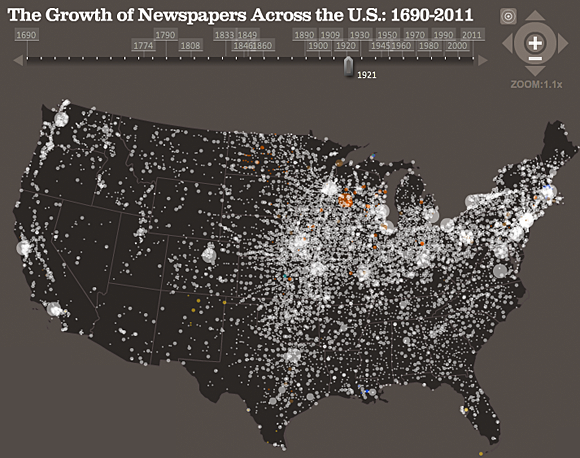
Journalism’s Voyage West — The growth of Newspapers Across the US: 1690-2011, by Stanford University
(Click to see the full interactive visualization.)
Personal Messages from Twitter, created by Twitter
So what are the design elements and characteristics that make these visualizations so powerful?
Data layer
In each of the examples above, we witness the compelling effect of data transformed from an abstract state to a physical representation on a map, instantly bringing it to life. This is the primary layer of the visualization. The challenge for the designer is to choose the right marker with which to represent the data point, with size and color being the most prominent considerations.
In some cases, we see the design of data markers being used to combine the representation of additional data variables beyond the geographical positioning. These might include a data category encoded through color (as seen in the presentation of depth in the “The Japanese Quake Map“) or a quantitative measure revealed through size (as demonstrated in “The Geography of Job Losses“).
Data points clearly need to be sized so they are visible without expanding beyond their specific locations or positions and cluttering the display. This is typically a problem associated with markers that double up in duty to represent quantitative values, as seen in “A Day in the Life of NYTimes.com.” Here, we see the radius of the circular shapes expanding far and wide across large areas, which can result in the hiding of or bleeding of markers into other data points.

Expanding circles, such as those in “A Day in the Life of NYTimes.com,” can hide other data points.
The challenge of displaying multiple data items around or on a similar geographical location is also critical, especially when working within the confines of such a small mapping design space. One of the most elegant solutions is seen in the “US expansion through post offices” visualization, which shows darker clusters of data points where there are clearly dense volumes.
Color and Background
The effectiveness of a visualization will be strongly influenced by how well the designer synthesizes the data layer with the background layer. The key influencing properties here are the color scheme and map choice.
Color choices should be influenced by the need to amplify the recognition and visibility of the data points. In the examples displayed, we see contrasting approaches to the deployment of color. In “Journalism’s Voyage West,” we see dark mapping shades working well as the backdrop to highlight the bright white data points as they emerge. The visualization of “US expansion through post offices,” on the other hand, switches this approach with a very light mapping image and an unsaturated — and probably semitransparent — brown hue to represent data. These color properties help resolve the overlay of multiple data points, as mentioned above.
For the mapping imagery, the issue is whether to present a detailed terrain like “The Japanese Quake Map” or just to use the shape of the geographical regions, like in the “Personal Messages from Twitter” project. In the quake map, the data points are generally plotted out at sea, otherwise there would be quite a visual clash, making it difficult for the data points to stand out. Unless you really need the geographical details, shapes alone — perhaps with limited labeling — work very well and help keep the data center stage.
There is the option, of course, to use no mapping layer at all, as exhibited in the “Visualizing Facebook” projects. In this case, patterns formed by the locations of and relationships between Facebook users actually illustrates much of the world map. We then learn as much from the darkness of expected and absent regions as we do from the areas that have data points. However, this is only really appropriate if you have vast amounts of data to plot.
Animation and interaction
Central to the impact and effectiveness of these designs is the simple animation of the data over time. Some exist with just a play/pause button; others have more interactive options to control the speed, flow and progress of the timeline.
For the viewer, there is palpable excitement when anticipating how the patterns will evolve; when the data spread will increase or decline; when the data activity will speed up or slow down; and when it will pop up in new, previously uncharted territories.
One of the most interesting design features is how designers choose to manage the presentation of new data points as time progresses. The pulsing rain-drop effect used in Nathan Yau’s “The Growth of Walmart and Sam’s Club (1962-2010)” visualization is a wonderfully conceived approach. It really helps to briefly draw the viewer’s attention to new and emerging data locations. Similarly, on the “US expansion through post offices” project, the designer employs a clever blurring effect, subtly relegating the prominence of each data point soon after it has appeared.

The rain-drop effect used in “The Growth of Walmart and Sam’s Club (1962-2010)” momentarily draws the viewer’s attention to emerging data locations. (Click to see the full version.)
Other creative features can add extra usability to the interactive experience, such as panning across and zooming within the map to see more localized details of interest.
Annotation
The sometimes neglected inclusion of information to help explain and facilitate the viewing experience is such a key visualization layer. It can elevate a visualization from a nice animation to something truly revealing, such as the use of milestone points along a horizontal timeline to provide contextual understanding about key points in time.
While not included in the visualization itself, Derek Hawkins’ associated blog post does offer some fascinating narrative to go with his “US expansion through post offices” work. However, the best example of thorough annotation has to be the full site version of the “Journalism’s Voyage West” project. Aside from detailed, explanatory milestones, this version also includes a thorough introduction, clear data legends and the opportunity to explore the dataset underlying each data point.
Interpretation
Finally, we look at the value these interactive designs offer. The best designs, including those presented above, provide a dual utility: on one hand, revealing whole stories over time and location, and on the other, allowing us to unearth our own narratives through exploration.
Whether it is observing the journey of the United States’ population growth and expansion from east to west or the global relationships of those touched by the Japanese earthquakes, these animations reveal patterns and relationships we would have otherwise not seen when viewing the data alone. This encapsulates the very purpose of data visualization.
 Strata 2012 — The 2012 Strata Conference, being held Feb. 28-March 1 in Santa Clara, Calif., will offer three full days of hands-on data training and information-rich sessions. Strata brings together the people, tools, and technologies you need to make data work.
Related: