
Jer Thorp (@blprnt), the data artist in-residence for The New York Times, was recently asked by Popular Science to create a visualization that represents the magazine’s 138-year archive. In a blog post, Thorp describes his process and the eventual outcome: a visualization that “is anchored by a kind of molecular chain.”
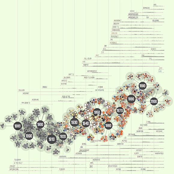
Screenshot of the Popular Science archive visualization (click to enlarge).
The chain is surrounded by a word-frequency histogram that depicts usage issue by issue. The changing usage and vocabulary, no surprise, highlights the changing technology itself. For example, “microcomputer” gave way to “email.”
Picking out interesting words from all of the available choices (pretty much the entire dictionary) was a tricky part of the process. I built a custom tool in Processing that pre-visualized the frequency plots of each word so that I could go through many, many possibilities and identify the ones that would be interesting to include in the final graphic. This is a really common approach for me to take — building small tools during the process of a project that help me solve specific problems. For this visualization, I actually ended up writing 4 tools in Processing — only one of which contributed visually to the final result.
You can see more of the images of this visualization in Thorp’s Flickr account.
Found a great visualization? Tell us about it
This post is part of an ongoing series exploring visualizations. We’re always looking for leads, so please drop a line if there’s a visualization you think we should know about.
 Strata 2012 — The 2012 Strata Conference, being held Feb. 28-March 1 in Santa Clara, Calif., will offer three full days of hands-on data training and information-rich sessions. Strata brings together the people, tools, and technologies you need to make data work.
More Visualizations: