
Randall Munroe of xkcd has created an infographic titled “Money: A Chart of Almost All of It, Where It Is and What It Can Do.” It’s an incredible visualization representing trillions of dollars — what money is spent on (everything from iPads to charity to federal expenditures), and how money is earned (for individuals, corporations, charities, governments, etc.).
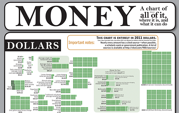
A small portion of “Money: A Chart of Almost All of It, Where It Is and What It Can Do.” Click to see the entire visualization.
Much like the radiation chart that Munroe drew earlier this year, this money visualization attempts to put dollar figures into perspective. It provides a translation, of sorts, between the different values — between, for example, the thousands and millions of dollars spent and received.
Even though the graphic uses the same sized blocks to depict all of this, it’s still hard to fathom the differences between the cost of a 20-week vacation in Hawaii, the cost of an F-22 Raptor, and the cost of a velociraptor in a “Jurassic Park” movie (all depicted in the graphic) — but that’s partly the point.
Munroe also lists his sources.
Found a great visualization? Tell us about it
This post is part of an ongoing series exploring visualizations. We’re always looking for leads, so please drop a line if there’s a visualization you think we should know about.
 Strata 2012 — The 2012 Strata Conference, being held Feb. 28-March 1 in Santa Clara, Calif., will offer three full days of hands-on data training and information-rich sessions. Strata brings together the people, tools, and technologies you need to make data work.
More Visualizations: