
The U.S. observed the Labor Day holiday this week, which means pundits and politicians alike were apt to talk about jobs. The news on the jobs front hasn’t been good lately, most recently with a report from the Labor Department indicating no jobs growth and revising figures from earlier months to paint a pretty grim picture for the unemployment rate. That rate now hovers around 9.1%.
TIP Strategies has recently released an updated version of its Geography of Jobs visualization, an animated map that makes job stats even more striking — and dour. Based on data from the U.S. Bureau of Labor Statistics, the map provides a historical timeline — starting in 2004 — of regions where jobs have been added and lost.
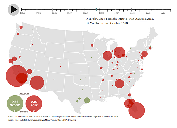
Screen from the Geography of Jobs. See the full interactive visualization.
Found a great visualization? Tell us about it
This post is part of an ongoing series exploring visualizations. We’re always looking for leads, so please drop a line if there’s a visualization you think we should know about.
 Strata Conference New York 2011, being held Sept. 22-23, covers the latest and best tools and technologies for data science — from gathering, cleaning, analyzing, and storing data to communicating data intelligence effectively.
More Visualizations: