
School is back in session for most college students, and by now many have chosen the seats they plan to occupy for the rest of the semester. Of course, where you choose to sit depends on a number of factors: the size of the class, the layout of the seats, the friends you have or make there, and your preference for the front or the back of the room.
Software development and design company Skyrill has created a visualization of the seating habits of a graduate-level class at MIT. It shows that these particular students tend to move around quite a bit.
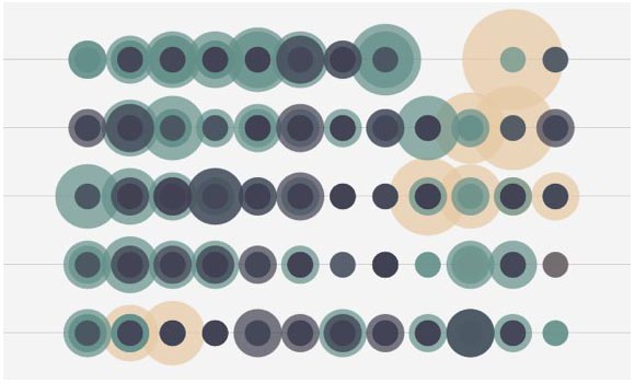
Screenshot of Skyrill’s “Classroom seating habits” visualization. The top of the visualization shows the front of the classroom. Circle sizes represent how often a student sat in a particular seat. Click to see the full interactive version.
The top of the visualization shows the front of the classroom, and it moves back from there. The larger the circle, the more often a student has sat in that seat.
The interactive visualization lets you select different numbers of students, and you can animate it to see where they sat throughout the semester. You can also choose to focus on those students who chose to sit in the same “zone” or those who moved around a lot.
The visualization was created using d3 and jQuery.
(Hat tip to Flowing Data.)
Found a great visualization? Tell us about it
This post is part of an ongoing series exploring visualizations. We’re always looking for leads, so please drop a line if there’s a visualization you think we should know about.
More Visualizations: